Hyperlink Control
HTML is displayed as text in the WYSIWYG View
How to specify space above and below a
hyperlink
See also: Text Control, Working With Texts, Styling Assistants, Introduction to Styling, Controls, Layouts
Description
A Hyperlink Control is a text displayed as a hyperlink. The text can be configured in the same way as for a Text Control and shares the same functionality including multi-language support. See Working With Texts for more information on the available texts functionality.
A hyperlink is either external meaning that the link is to a URL outside of the current form, or internal meaning that the link should trigger an internal event. This is configured by property Link is external. When the link is configured as external, the hyperlink can be configured with properties External URL and Hyperlink target window; when the link is internal, the event scripts are configured with property On Click.
A Hyperlink Control is created by dragging the Hyperlink Control icon from the palette which then displays the Texts Dialog to enter the hyperlink text. Once created, the hyperlink text can be changed by double clicking on the text as it appears in the WYSIWYG View or by clicking the … button adjacent to the Hyperlink text property.
All hyperlinks will automatically have a hand cursor (cursor:pointer) and this does not have to be specified.
Properties
See also control common properties and local/inherited control properties.
Style Tab - Styling Assistant
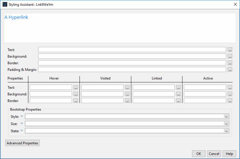
A hyperlink can have multiple states and the Hyperlink Control has properties that correspond with each of these states, plus a set of default properties that apply to all states unless specifically overridden. The hyperlink states are:
- Hover – when the mouse is moved over the link
- Visited – the link has already been visited (clicked) by the user
- Linked - the link has not been visited (clicked) by the user
- Active - the link has been clicked by the user but the target page is not yet displayed
|
Property |
Description |
Name1 |
Type1 |
Get1 |
Set1 |
Get/Set Values1 |
|
These properties
apply to all hyperlink states unless overridden by a property for a specific
state |
||||||
|
Text |
Text properties: font, size, color, bold, italic etc. See text properties. |
|
|
|
|
|
|
Background |
See background properties. |
|
|
|
|
|
|
Border |
Border properties for the hyperlink text box. See border properties. |
|
|
|
|
|
|
Padding & Margin |
Padding is the space between the hyperlink text and the border. Margin is the space beyond the border. See padding and margin properties. These properties apply to all hyperlink states and cannot be overridden. Only left and right padding/margin properties are supported. Specify top and bottom padding/margin by wrapping the Hyperlink Control in a Panel Control and add the padding/margin properties to this. Alternatively, use a Spacer Control. |
|
|
|
|
|
|
These properties
apply just to the named hyperlink state |
||||||
|
Hover |
Override above properties for the hover state.
|
hoverTextStyle .xxx |
|
|
|
|
|
Visited |
Override above properties for the visited state.
|
visitedTextStyle .xxx |
|
|
|
|
|
Linked |
Override above properties for the linked state.
|
linkedTextStyle .xxx |
|
|
|
|
|
Active |
Override above properties for the active state.
|
activeTextStyle .xxx |
|
|
|
|
|
Bootstrap: These properties are only available when a form is configured to use bootstrap i.e. the framework property in Form Properties is configured to use bootstrap (by default this property is inherited from the Presentation Template). See Using Bootstrap with Verj.io. |
||||||
|
Style |
Sets the Bootstrap style. This results in the addition of
the appropriate bootstrap classes. |
bootstrapStyle |
Character |
Yes |
Yes |
Primary Secondary Success Danger Warning Info Light Dark Link Outline Primary Outline Secondary Outline Success Outline Danger Outline Warning Outline Info Outline Light Outline Dark |
|
Size |
Sets the Bootstrap size. This results in the addition of
the appropriate bootstrap classes. |
bootstrapSize |
Character |
Yes |
Yes |
Large Small |
|
State |
Sets the Bootstrap state. This results in the addition of
the appropriate bootstrap classes. |
bootstrapState |
Character |
Yes |
Yes |
Active Disabled |
|
|
|
|
|
|
|
|
|
Style |
CSS class and inline style for the text. This is applied for all hyperlink states. |
cssClass style |
Character |
Yes |
Yes |
As per HTML class parameter As per HTML style parameter |
Html Element Properties Tab
This allows you to add element properties to the root element of the Control – see Html Element Properties for more information.
Hyperlink Control tab
|
Property |
Description |
Name1 |
Type1 |
Get1 |
Set1 |
Get/Set Values1 |
|
Link is external |
Indicates whether the link is external or internal (see above). When the link is external, properties External URL and Hyperlink target window are enabled. When the link is internal, the On Click property is enabled. |
useExternalURL |
Boolean |
Yes |
Yes |
|
|
External URL |
This is the hyperlink URL displayed when Link is external is selected. See URL properties for more information. |
href |
Character |
Yes |
Yes |
|
|
Hyperlink target window |
This is the target window id or frame id in which the hyperlink URL is displayed. See URL Target Property for more information. |
target |
Character |
Yes |
Yes |
|
Events tab
|
Property |
Description |
Name1 |
Type1 |
Get1 |
Set1 |
Get/Set Values1 |
|
On Click |
This event is executed when the user clicks the link and Link is external is not selected. Any applicable validation events are run before the on click event. If a validation event fails, the on click event is not executed. See Events for more information. |
|
|
No |
No |
|
Texts tab
|
Property |
Description |
Name1 |
Type1 |
Get1 |
Set1 |
Get/Set Values1 |
|
Hyperlink text |
The displayed hyperlink text. |
text |
Character |
Yes |
Yes |
|
|
Mouse over text |
Text displayed to the user when the mouse is moved over the button. |
title |
Character |
Yes |
Yes |
|
1 See accessing control properties from scripts
Examples of setting properties via API based language:
controls.HYPERLINK1.textBold
= "Bold";
controls.HYPERLINK1.backgroundColor
= "yellow";
controls.HYPERLINK1.text.text
= "A new link text";
controls.HYPERLINK1.hoverTextStyle.textDecoration
= "Underline";
controls.HYPERLINK1.visitedTextStyle.textColor
= "green";
Examples of setting properties via FPL:
set
HYPERLINK1.textBold = 'Bold';
set HYPERLINK1.backgroundColor = 'yellow';
set HYPERLINK1.text = 'A new link text';
set HYPERLINK1.hoverTextStyle.textDecoration =
'Underline';
set HYPERLINK1.visitedTextStyle.textColor =
'green';
Hints and Tips
HTML is displayed as text in the WYSIWYG View
WARNING: the system renders the page as XHTML in the WYSIWYG View, and not all HTML content is considered valid within the XHTML standard. This can sometimes cause unexpected results when HTML content is added to a page. Click here for further information.
How to specify space above and below a hyperlink
Only left and right padding/margin properties are supported by this control. Specify top and bottom padding/margin by wrapping the Hyperlink Control in a Panel Control and add the padding/margin properties to this. Alternatively, use a layout gap or a Spacer Control – click here for more information.
Right Click Menu Actions
Click here for right-click menu actions available to all controls.
There are no specific right click actions for this control.
Appearance in Outline View
A Hyperlink Control is shown with the control name in brackets: