Spacer Control
See also: Separating Controls, Introduction to Styling, Styling Assistants, Controls, Layouts
Description
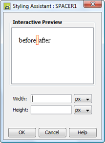
This control represents a spacer that can be used to generate a horizontal space, a vertical space or both of these. This control can be used in conjunction with any layout. It has two properties width and height, both available via the styling assistant.
In most cases, where a gap is required between controls, it is better practice to apply padding or margins to one of the controls or configure a gap between the controls using layout properties on their container – click here for further details. A Spacer Control should only be used in circumstances where these techniques do not produce the desired result.
When a Spacer Control is added to a container with no layout or a Flow Layout, this can sometimes result in the Spacer being the first control on a line when the page is resized. When this occurs, the Spacer Control will still occupy space and will cause the next control to appear indented. This is one of the reasons why it is better practice to use padding or margins on the controls to be separated.
Properties
See also control common properties and local/inherited control properties.
Style Tab – Styling Assistant
|
Property |
Description |
Name1 |
Type1 |
Get1 |
Set1 |
Get/Set
Values1 |
|
Width |
Sets the width for the Spacer Control. Use this for horizontal separation. |
width |
Character |
Yes |
Yes |
As per CSS width property. |
|
Height |
Sets the height for the Spacer Control. Use this for vertical separation. |
height |
Character |
Yes |
Yes |
As per CSS height property |
1 See accessing control properties from scripts
Examples of setting properties via API based language:
controls.SPACER1.width = "30px";
controls.SPACER1.height = "10px";
Examples of setting properties via FPL:
set
SPACER1.width = '30px';
set
SPACER1.height = '10px';
Html Element Properties Tab
This allows you to add element properties to the root element of the Control – see Html Element Properties for more information.
Right Click Menu Actions
Click here for right-click menu actions available to all controls.
There are no specific right click actions for this control.
Hints and Tips
See remarks under description above.
Appearance in Outline View
A Spacer Control is shown with the control name in brackets: