Right Click Menus for Controls
Right
Click Menu – Single Control
Right Click Menu – Multiple Controls
Right Click Menu – Deployed Components
See also: WYSIWYG View, Outline View
Right Click Menu – Single Control
When a single control has been selected, using either the WYSIWYG View or the Outline View, right click displays an action menu similar to the one shown below:
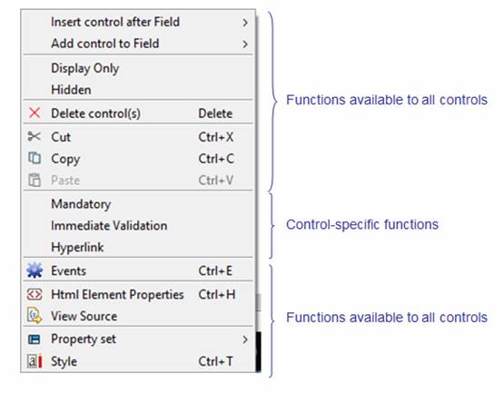
This menu contains functions which are applicable to all controls, plus a group of control-specific functions if applicable. The shared functions are described below, whereas the control-specific functions are described in the documentation for the individual controls. (Click here for a list of controls then follow the links to the appropriate control.)
Insert control after xxx
Add control to xxx
Adds a control either after (Insert control after) or as a child of (Add control to) the selected control, where xxx is the control type. Add control to is only enabled if the control supports child controls. Both actions present an additional submenu:
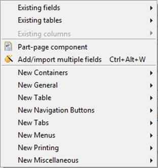
· Existing fields shows a list of existing fields; select the required field(s) then click the Add button at the bottom of the field list. Use the Ctrl key to select multiple fields and the Shift key to select a range of fields.
· Existing tables shows a list of existing tables; select the required table(s) then click the Add button at the bottom of the table list. Use the Ctrl key to select multiple tables and the Shift key to select a range of tables.
· Existing columns shows a list of existing table columns; select the required table columns(s) then click the Add button at the bottom of the table column list. Use the Ctrl key to select multiple columns and the Shift key to select a range of columns.
· Part-page component shows a list of available part-page components. See component concepts for more information on components.
· New xxxx shows a list of all available controls by section; one line is displayed for each section of controls as displayed in the Palette View.
Display Only
Makes the control and all of its children display only. A control is considered to be display only if the control or any of its parents have been set as display only.
Hidden
Hides the control and all of its children. A control is considered to be hidden if the control or any of its parents have been set as hidden.
Delete Control
Deletes the selected control
Cut/Copy
Controls can be copied or cut from one location and pasted to another, and this can be used within a single form or used to copy controls between forms or components. The Outline and WYSIWYG views can be used interchangeably. The Page Control which acts as the root control for each page cannot be copied. It is also not possible to copy individual Table Column Controls – only the entire parent Table Control can be copied.
Paste
Paste is only enabled when controls have previously been copied to the clipboard and the pasted controls can legitimately be added as a child of the selected item. Controls are inserted as the last child of the selected item. Controls are automatically renamed when a control with the same name already exists in the target form; this is done by adding an underscore and a number to the control name.
Some controls have associations to other form elements. How these associations are handled during a paste operation is shown in the table below:
|
Control being
pasted |
Association |
Paste to the same
form |
Paste to another
form |
|
Many controls |
Texts |
Texts are copied and renamed if the text id is already in use. |
Texts are copied and renamed if the text id is already in use. |
|
Field Control |
Fields |
The pasted Field Control will be linked to the source field (the field linked to the copied Field Control). When the source field does not exist, it will be recreated by the paste. See paste fields for further details. |
Fields are always copied. i.e. a paste of a Field Control creates a new copy of both the control and the field to which it is linked. A field will be renamed if a field with the same name already exists. See paste fields for further details. |
|
Table Control and Repeater Control |
Tables |
The pasted Table/Repeater Control will be linked to the source table (the table linked to the copied control). When the source table does not exist, it will be recreated by the paste. |
Tables are always copied. i.e. a paste of a Table or Repeater Control creates a new copy of both the control and the table to which it is linked. A table will be renamed if a table with the same name already exists. |
|
Table Column Control |
Table Columns |
Same as Field Control. |
Same as Field Control. |
|
Many controls |
Events |
Events are copied. |
Events are copied. Note that when copying between forms/components in different projects, you may also need to copy any referenced scripts. |
When the clipboard contains an entire deployed part-page component (this is recognised when a Component Control is included in the cut/copy selection), the paste operation will result in a new deployed instance of the component. In this case, a new instance of the deployed component is created by copying the entire contents of the component i.e. controls, fields, tables, texts, component business views. If the component prefix is already used in the target form, a dialog is shown requesting a new prefix.
When the clipboard contains controls that are part of a part-page component but the Component Control is not included, the controls are pasted as if they are not part of a component and double underscores in all names are changed to single underscores.
Events
Shows the events dialog, where any events supported by the control can be configured.
Html Element Properties
Opens the Html Element Properties Assistant, where Locators, Custom Attributes and Custom Event Handlers for the control can be configured (see Creating Rich Clients).
View Source
Opens a window which shows the entire XHTML source for the current page and scrolls to and highlights the currently selected control (and any children it contains). This source can be used to examine the structure of the control as it will sent to the Browser (please note that Microsoft® Internet Explorer 6 and 7 occasionally requires that some controls have a different structure as presented here).
Property Set
See using Property Sets.
Style
Invokes the Styling Assistant for the control.
Right Click Menu – Multiple Controls
When more than one control has been selected, using either the WYSIWYG View or the Outline View, right click displays an action menu similar to the one shown below:
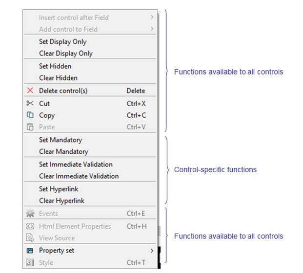
Insert control after xxx
This action is always disabled.
Add control to xxx
This action is always disabled.
Set Display Only
Makes the controls and all child controls display only. A control is considered to be display only if the control or any of its parents have been set as display only.
Clear Display Only
Removes the display only setting, making the controls enterable. All child controls will also be made enterable unless they are also marked as display only.
Set Hidden
Hides the controls and all child controls. A control is considered to be hidden if the control or any of its parents have been set as hidden.
Clear Hidden
Makes the controls visible. All child controls will also be visible unless they are also marked as hidden.
Delete Control
Deletes the selected controls
Cut/Copy
See Cut/Copy.
Paste
See Paste.
Events
This action is always disabled
Html Element Properties
This action is always disabled
View Source
This actions is always disabled
Property set
When controls of the same type are selected, this can be used to load or link a Property Set to multiple controls. See using Property Sets.
Style
This action is always disabled
Right Click Menu – Deployed Components
When a control is part of a deployed linked component, the following additional item is shown:
 Convert to embedded
– converts the component to be embedded. Click here for further details.
Convert to embedded
– converts the component to be embedded. Click here for further details.