WYSIWYG View
See also: Outline View, Form Editor, Controls, How Style Is Applied
Introduction
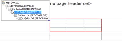
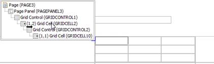
The WYSIWYG View is designed to be used in conjunction with the Outline View. Each page consists of a number of controls organised in a tree-like structure. The WYSIWYG View shows a page as it will appear in a browser, whereas the Outline View shows the controls as a tree hierarchy. Both of these panels show alternate views of the same underlying controls. Most editing functions are available from both panels.
Selection and highlighting of items between the Outline and
WYSIWG views can be synchronized by clicking on the  toggle switch at the top of the Outline View.
WARNING! the system renders the page as XHTML in the WYSIWYG View, and not all HTML content is considered valid within the XHTML standard. This can sometimes cause unexpected results when HTML content is added to a page. Click here for further information.
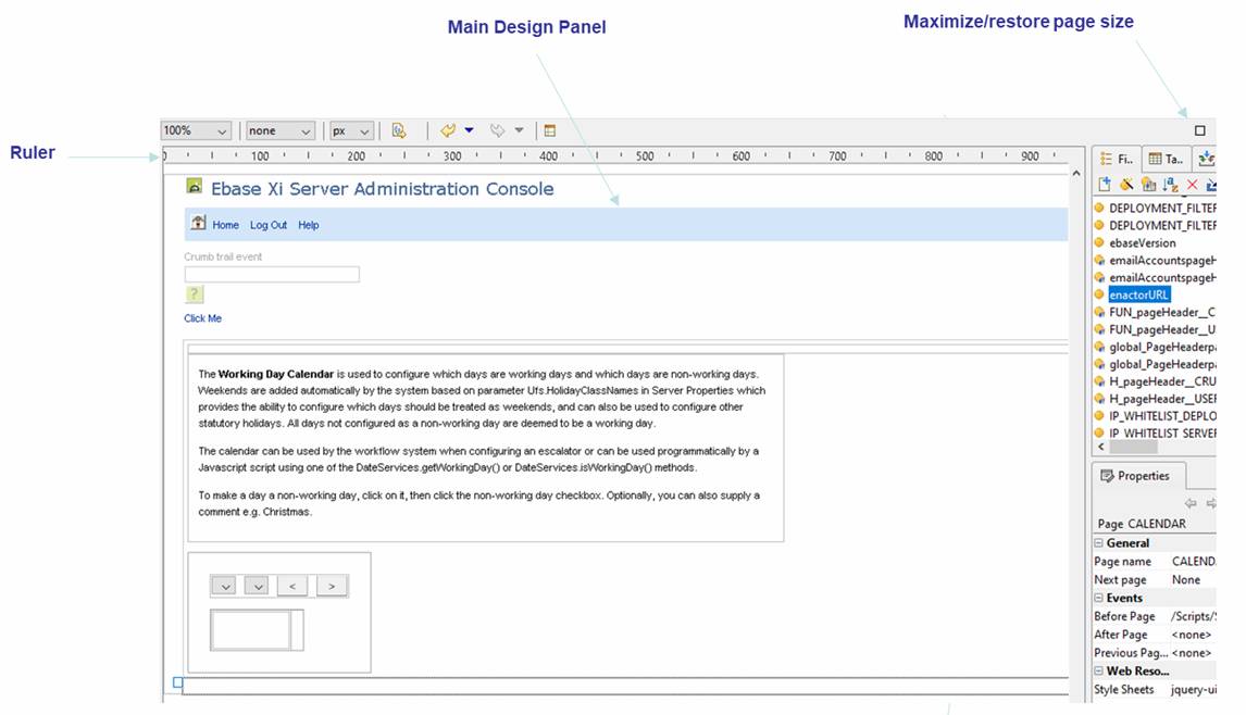
Ruler
The Ruler provides a measure of window width in the selected size units.
Help
The help key F1 displays help for the currently selected control at any point.
Main Design Panel
Identifying Controls
All container controls are surrounded by a thin grey border to help clarify where one control ends and the next begins. As the mouse is moved over any given control, a black dotted border is drawn identifying the bounds of the control. When a control is hidden, it is greyed out.
Selecting Controls
When the mouse is clicked over a control, the underlying control is selected: it is highlighted with a light blue background and given a dark blue border. Also, for container controls and certain other controls, a yellow identification bar is shown above the control. This yellow bar may be followed by a control widget (for controls that support widgets).
In addition, as the mouse is moved over a control, a small blue box appears at the top left of its occupied space; this is to help in the situation where many controls are very close together and therefore difficult to select. Moving the mouse over this blue box pops up a tree showing all parent controls; moving the mouse over the controls in the tree highlights the underlying control with a red border as a further aid to identification, and clicking a control in the tree selects the control.
Multiple controls can be selected by holding down the Ctrl key and left clicking on the controls. A range of controls can be selected by holding down the Shift key.
Control Widgets
A control widget is an additional item added to the WYSIWYG View for certain controls, and is shown when the control is selected in the WYSIWYG View. These widgets are shown above the control they represent as a bar with a light yellow background as shown below (for a group panel control):
Control widgets provide specific designer functionality for the control they represent – usually this is some sort of width adjustment. See the documentation for each control for more information on control widgets. Control widgets exist only within the WYSIWYG View and play no role at runtime.
Adding Controls
Controls can be added to a page in a number of ways:
- By dragging items from one of the other view panels (see also Drag And Drop). The following are supported:
· Dragging any control from the Palette View. Note that for field and table controls, this will also create a new field or table respectively.
· Dragging one or more fields from the Fields View
· Dragging one or more tables or table columns from the Tables View
Drop locations are shown as either a vertical or horizontal black line depending on the layout in use for the target drop control.
- Via right click.
- By
clicking on the fields wizard
 (shortcut
Alt Ctrl W) on the toolbar (this supports the creation of new fields and field controls)
(shortcut
Alt Ctrl W) on the toolbar (this supports the creation of new fields and field controls)
When a new control is added, its properties are shown in the Properties View.
Drag And Drop
Controls can be moved by dragging: either within the WYSIWYG View, within the Outline View, or between these two views. Drop locations are shown as either a vertical or horizontal black line dependent of the layout in use for the target drop control.
In addition, as the mouse is moved over each control, a small blue box appears at the top left of its occupied space; this is to help in the situation where many controls are very close together and therefore the exact drop location can be difficult to select. Moving the mouse over this blue box pops up a tree showing all parent controls; the drop location is shown as a black line either under the icon for the control – signifying drop after the control, or a little to the right – signifying drop inside the control.
Deleting Controls
Controls are deleted by first selecting them, then either:
- Pressing the Delete key
- Right clicking and selecting Delete control(s)
Right Click Functionality
Right clicking on a control shows the right click menu.
Editing Texts
Double clicking on any text shows the text editing dialog which supports:
- Changing the text
- Choosing another form/component text or a shared text
- Maintaining language texts
- Indicating that the text contains formatting HTML