Control Styling Properties:
Padding, Margin, Gaps
This document discusses the various ways that you can introduce separation (spacing) between controls.
There are three main techniques provided for separating controls.
These three techniques are presented in the order that represents their relative ease of use i.e. the first topic (gaps) is easiest.
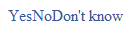
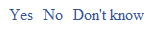
We’re going to use a single example to illustrate all three techniques: it consists of three clickable hyperlinks “Yes”, “No” and “Don’t know” inside a panel (the parent container).
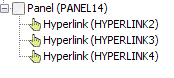
Our starting point shows the Panel Control with no layout configured, and the child hyperlink controls are squashed together with no intervening space:
Gaps
A gap is a layout property that is supported by the following layouts: Horizontal Box Layout, Vertical Box Layout, Flow Layout. As the name suggests, it represents the gap between adjacent controls within the same parent container control. Only one gap property can be specified for each container so the same gap is applied between all child controls; this property cannot be overridden for individual child controls.
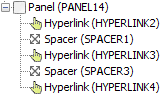
The gap property is configured by clicking on Layout properties with a container control selected (PANEL14 in the example above).
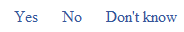
Here are some examples of applying gaps with different layouts to the hyperlink example above:
Horizontal box layout with 20px gap:
Vertical box layout with 5px gap:

Padding and Margins
Both padding and margin are CSS properties. Whereas gap is applied to all children of a container, padding and margin can be configured for individual controls. To understand these properties, we need to take a quick look at the CSS box model which defines the relative positions of the element being styled, it’s padding, border and margins:
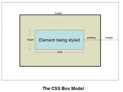
At the center of the model is the element being styled – in most cases this is synonomous with a control.
Padding is the space between the edge of the element and its border. If the control has a background color, it will be visible here (as illustrated in the diagram).
Margin is the space beyond the control’s border. If the parent control has a background color, it will be visible here.
At a practical level, padding and margin can sometimes appear to be identical. The differences between them are only apparent when a border and/or background color has been configured.
Padding and margin are configured by using styling assistants. You will notice that the padding property is not always available, this is because for some controls e.g. images, the border is an implicit part of the control.
To continue with the hyperlink example, we’ll return to the configuration shown at the start of this document with no layout and all three hyperlinks squashed together:
Then apply a 10px margin to the “No” link:
To illustrate the difference between padding and margin, we’ll now apply some padding to the “No” link together with a yellow background color and a red dotted border:
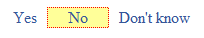
Sometimes, adding padding or margins can cause a control to break out of the width occupied by its parent, usually overflowing to the right. Click here for more information and solutions to this issue.
Spacer Control
A Spacer Control can also be used to introduce horizontal and/or vertical space between controls. It is a control like any other and is implemented by dragging the control from the palette (Miscellaneous section). A width and/or height can then be configured using the control’s styling assistant.
Here is the hyperlink example with two 20px spacer controls placed either side of the “No” link: