Vertical Box Layout
See also: Containers, Layouts, Horizontal Box Layout, Introduction to Styling, Styling Assistants, Controls
Alignment
properties appear to do nothing
How
to vary the spacing between controls
Description
The Vertical Box Layout places each child control on a new line. Layout properties are available to configure both horizontal and vertical alignment and the vertical gap between adjacent controls. The Vertical Box Layout is implemented as an HTML table where each child control is placed inside a table cell on a new row.
Layout Properties
Layout properties are accessed by clicking the Layout properties property of any container control that has a layout type set to Vertical Box.
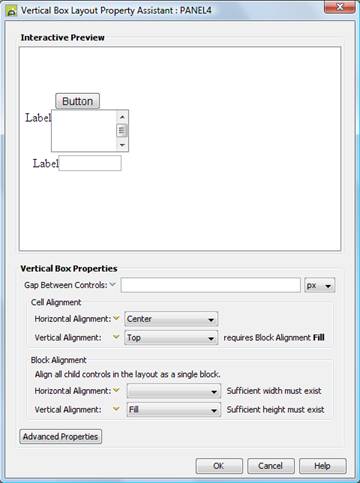
Qualifier: layoutProperties.VERTICAL_BOX
|
Property |
Description |
Name1 |
Type1 |
Get1 |
Set1 |
Get/Set Values1 |
|
Gap Between Controls |
Sets the vertical spacing between adjacent controls. |
spacerSize |
Character |
Yes |
Yes |
As CSS font-size property |
|
Cell Alignment: |
|
|
|
|
|
|
|
Horizontal Alignment |
Sets horizontal alignment for each child control within its containing table cell. See below. This property can be overridden for individual controls using the Override layout property. The default value is left. |
cellHAlign |
Character |
Yes |
Yes |
Click here for values. |
|
Vertical Alignment |
Sets vertical alignment for each child control within its containing table cell. See below. This property is only enabled when Block Vertical Alignment is set to fill. This property can be overridden for individual controls using the Override layout property. |
cellVAlign |
Character |
Yes |
Yes |
Click here for details. Value Fill is not supported. |
|
Block Alignment: |
|
|
|
|
|
|
|
Horizontal Alignment |
Sets horizontal alignment for all child content – all child controls are aligned as a single block. See below. The default value is fill. |
hAlign |
Character |
Yes |
Yes |
Click here
for values. |
|
Vertical Alignment |
Sets vertical alignment for all child content – all child controls are aligned as a single block. See below. |
vAlign |
Character |
Yes |
Yes |
Click here
for details. |
|
Advanced
Properties: |
|
|
|
|
|
|
|
Layout table style |
tableClass tableStyle |
Character |
Yes |
Yes |
As per HTML class parameter As per HTML style parameter |
|
|
Layout cell style |
See Advanced Properties. This property can be overridden for individual controls using the Override layout property. |
layoutClass layoutStyle |
Character |
Yes |
Yes |
As per HTML class parameter As per HTML style parameter |
1 See accessing control properties from scripts
Examples of setting properties using Javascript:
controls.PANEL1.layout.spacerSize
= "14px";
controls.PANEL1.layout.cellHAlign
= "Center";
controls.PANEL1.layout.tableClass
= "myLayoutTableClass";
controls.PANEL1.layout.layoutStyle
= "padding-top:5px;padding-bottom:5px;";
Examples of setting properties using FPL:
set
PANEL1.layoutProperties.VERTICAL_BOX.spacerSize = '14px';
set PANEL1.layoutProperties.VERTICAL_BOX.cellHAlign
= 'Center';
set
PANEL1.layoutProperties.VERTICAL_BOX.tableClass = 'myLayoutTableClass';
set
PANEL1.layoutProperties.VERTICAL_BOX.layoutStyle =
'padding-top:5px;padding-bottom:5px;';
Horizontal Alignment
There are two horizontal alignment properties: Block Horizontal Alignment and Cell Horizontal Alignment. Both of these properties are only effective when the container is wide enough to accommodate horizontal repositioning of its children. The container’s width might be set explicitly using the width property or it might be implicit in which case it will have the width of its widest child. In the examples below, an explicit width has been set on the container so that the effect of changing the properties can be clearly seen.
Block Horizontal Alignment
This property applies to all child controls of the container as a whole e.g. setting this property to center will place all controls as a block in the center of the container’s horizontal space:
The default is Fill.
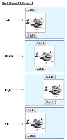
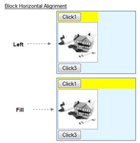
In the illustration above, Left and Fill horizontal alignments appear identical. The difference between these is that with Fill, the table cells are stretched to the full width of the container. This is illustrated in the example below where a background color is applied to one of the buttons:
Cell Horizontal Alignment
This property sets the horizontal alignment for each child control within its containing table cell. The illustration below shows various Cell Horizontal Alignment values with Block Horizontal Alignment set to Center but they apply equally for the other options for this property. Cell Horizontal Alignment can be overridden for individual controls using the Override layout property.
The default is Left.
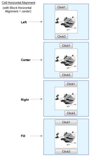
Note that Fill will attempt to stretch each control horizontally so that it fills the available space. Only certain controls such as buttons and container controls are capable of being stretched in this way, and this setting is ignored for any other controls. For those controls which are capable of being stretched, a value of Fill causes the width setting of any such child controls to be ignored.
Vertical Alignment
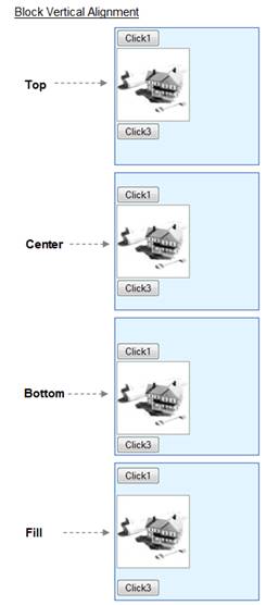
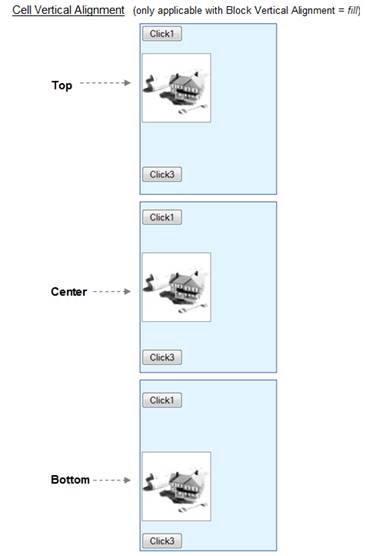
There are two vertical alignment properties: Block Vertical Alignment and Cell Vertical Alignment. Both of these properties are only effective when the container is high enough to accommodate vertical repositioning of its children i.e. the container’s height has been set explicitly using the height property. In the examples below, an explicit height has been set on the container so that the effect of changing the properties can be clearly seen.
Block Vertical Alignment
This property applies to all child controls of the container as a whole e.g. setting this property to center will place all controls as a block in the center of the container’s vertical space:
Cell Vertical Alignment
This property is only effective when the previous property Vertical Alignment is set to Fill. It then sets the vertical alignment for each child control within its containing table cell.
Note: use of this property can give varying results in different browsers.
This property can be overridden for individual controls using the Override layout property.
Advanced Properties
The Vertical Box Layout lays out its child controls vertically in a table. The Advanced Properties button allows specification of CSS classes and inline style for the layout table (<table>) and layout table cell (<td>) tags.
In the following illustration a Vertical Box Layout is applied to Panel Control PANEL1.

The Layout cell style property can be overridden for individual controls using the Override layout property.
Hints and Tips
Alignment properties appear to do nothing
- For vertical alignment, check that sufficient height exists to allow controls to be repositioned. See above.
- For horizontal alignment, use the Cell Horizontal Alignment property in preference to the Block Horizontal Alignment property (the Block Horizontal Alignment property only does something if a width has been specified)
- For horizontal alignment, check that sufficient width exists to allow controls to be repositioned. See above.
How to vary the spacing between controls
Set the Gap Between Controls property to the smallest gap that you need – this sets spacing for all child controls. Then make any adjustments you need to individual child controls by setting top and/or bottom padding or margins. Alternatively add a Spacer Control and set its height.