Container Controls
Panel
Control – a basic building block
Header,
Footer, Nav, Section Controls
Repeater
and Repeater Row Control
See also: Introduction to Styling, Layouts, Controls
Introduction
Container controls form a sub-category within controls i.e. some controls are containers. A container is basically something that can contain other controls. Every container has a configurable layout which defines how the child controls of a container are positioned relative to each other – simple examples are horizontally and vertically. This ability to have a layout is the most important aspect of a container.
Panel Control – a basic building block
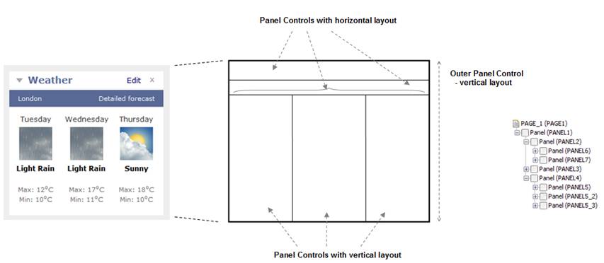
The simplest container is a Panel Control and this can be thought of as a rectangle (equivalent to a <div> in HTML). Panel Controls are frequently nested to produce complex page layouts, with each Panel Control having a different layout. This is illustrated in the following section from a web page which is constructed using a number of nested Panel Controls with either horizontal or vertical layout.
Header, Footer, Nav, Section Controls
These controls are all functionally equivalent to a Panel Control and inherit its properties and behavior. The only difference is that the enclosing HTML tag used with a Panel Control is <div> as opposed to <header>, <footer>, <nav>, <section>. Follow the links for more details: Header Control, Footer Control, Nav Control, Section Control.
Other Container Controls
There are a number of additional container controls that have more explicit functionality:
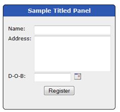
Titled Panel Control
A Titled Panel Control consists of a title bar with content beneath. It supports curved corners. The example below shows the content with a Field Grid Layout.
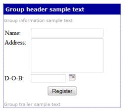
Group Panel Control
A Group Panel Control is similar to a Titled Panel and supports three texts – a group header text, information text and trailer text.
Page Panel Control
A Page Panel Control is almost identical to a Group Panel Control. It exists mainly to support upgrades from earlier Verj.io versions.
Grid and Grid Cell Control
A Grid Cell Control can only exist inside a Grid Control and provides basic container functionality for each cell within the grid, very similar to a Panel Control.
TabSet and Tab Control
A Tab Control can only exist inside a TabSet Control and provides basic container functionality for each tab within the tabset, very similar to a Panel Control.
Repeater and Repeater Row Control
A Repeater Control provides a way to format data in a table. The Repeater Control itself has a layout which determines how adjacent rows are laid out relative to each other. The Repeater Row Control also has a layout which determines how individual rows are formatted. In the following example the Repeater Control has a Column Layout with 2 columns and the Repeater Row has a Vertical Layout.
See Repeater Control for more information.