Group Panel Control
Control overflows to the right
See also: Containers, Introduction to Styling, Styling Assistants, Controls, Layouts, Titled Panel Control
Description
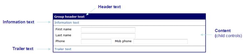
A Group Panel Control is a titled box container as shown in the example below. It has three texts – header text, information text, trailer text – and these texts and any child controls are displayed in a tabular layout. Child controls are displayed in the content area between the information text and trailer text and are laid out according to the selected layout configured for the control.
The table cell containing each text is only shown if the appropriate text has been specified.
Note: a Group Control that has no visible children (no children configured or all child controls are hidden) will not be displayed – header text, information text, trailer text are not shown.
See also Titled Panel Control which is a similar container control and offers a single title text and borders with curved corners.
Properties
See also control common properties and local/inherited control properties.
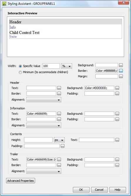
Style Tab - Styling Assistant
|
Property |
Description |
Name1 |
Type1 |
Get1 |
Set1 |
Get/Set Values1 |
|
Width |
Sets the width to one of the following: · A specific value e.g. 300px · The minimum value: this results in the Group Panel Control being just as wide as it needs to be to accommodate its content Note that this setting will be ignored if the parent container layout specifies a horizontal cell alignment of fill (this applies to Horizontal Box, Vertical Box and Column layouts). This is equivalent to specifying 100% above. Warning: when a specific value is set, any margins will be in addition to the specified value and can cause the Group Panel Control to “break out” of its parent space. Click here for further info. See also: hints and tips, understanding width. |
width |
Character |
Yes |
Yes |
As per CSS width property Child: equivalent to minimum |
|
Background |
Sets the background for the entire Group Panel Control. See background properties. |
|
|
|
|
|
|
Border |
Specifies a border for the entire Group Panel Control. See border properties. |
|
|
|
|
|
|
Margin |
Margin is the space between a control and its neighbours. See margin properties. |
|
|
|
|
|
|
Header: |
Following properties
apply to the header text |
|
|
|
|
|
|
Text |
Header text properties: font, size, color, bold, italic etc. See text properties. |
headerProperties .xxx |
|
|
|
|
|
Background |
Header text background properties. |
headerProperties .xxx |
|
|
|
|
|
Border |
Border properties for the header text box. See border properties. |
headerProperties .xxx |
|
|
|
|
|
Padding |
Padding is the space between the text and the border. See padding and margin properties. |
headerProperties .xxx |
|
|
|
|
|
Alignment |
Sets horizontal alignment for the header text. |
headerProperties .hAlign |
Character |
Yes |
Yes |
Click here for values. Value Fill is not supported. |
|
Information: |
Following properties
apply to the information text |
|
|
|
|
|
|
Text |
Information text properties: font, size, color, bold, italic etc. See text properties. |
infoProperties .xxx |
|
|
|
|
|
Background |
Information text background properties. |
infoProperties .xxx |
|
|
|
|
|
Border |
Border properties for the information text box. See border properties. |
infoProperties .xxx |
|
|
|
|
|
Padding |
Padding is the space between the text and the border. See padding and margin properties. |
infoProperties .xxx |
|
|
|
|
|
Alignment |
Sets horizontal alignment for the information text. |
infoProperties .hAlign |
Character |
Yes |
Yes |
Click here for values. Value Fill is not supported. |
|
Contents: |
Following properties
apply to the content area where child controls are shown as configured by the
layout type property. |
|
|
|
|
|
|
Height |
Sets the height of the content area |
contentHeight |
|
|
|
As per CSS height property |
|
Text |
Sets the text properties for any child controls: font, size, color, bold, italic etc. See text properties. |
contentText |
|
|
|
|
|
Padding |
Padding is the space between the content and its border. See padding and margin properties. |
contentPadding |
|
|
|
|
|
Trailer: |
Following properties
apply to the trailer text |
|
|
|
|
|
|
Text |
Trailer text properties: font, size, color, bold, italic etc. See text properties. |
trailerProperties .xxx |
|
|
|
|
|
Background |
Trailer text background properties. |
trailerProperties .xxx |
|
|
|
|
|
Border |
Border properties for the trailer text box. See border properties. |
trailerProperties .xxx |
|
|
|
|
|
Padding |
Padding is the space between the text and the border. See padding and margin properties. |
trailerProperties .xxx |
|
|
|
|
|
Alignment |
Sets horizontal alignment for the trailer text. |
trailerProperties .hAlign |
Character |
Yes |
Yes |
Click here for values. Value Fill is not supported. |
|
|
|
|
|
|
|
|
|
Group panel style |
CSS class and inline style applied to the table used to contain group texts and content. See Advanced Properties below. |
cssClass style |
Character |
Yes |
Yes |
As per HTML class parameter As per HTML style parameter |
|
Header text style |
CSS class and inline style applied to the header text. See Advanced Properties below. |
headerClass headerStyle |
Character |
Yes |
Yes |
As per HTML class parameter As per HTML style parameter |
|
Info text style |
CSS class and inline style applied to the information text. See Advanced Properties below. |
infoClass infoStyle |
Character |
Yes |
Yes |
As per HTML class parameter As per HTML style parameter |
|
Content style |
CSS class and inline style applied to the content area. See Advanced Properties below. |
contentClass contentStyle |
Character |
Yes |
Yes |
As per HTML class parameter As per HTML style parameter |
|
Trailer text style |
CSS class and inline style applied to the trailer text. See Advanced Properties below. |
trailerClass trailerStyle |
Character |
Yes |
Yes |
As per HTML class parameter As per HTML style parameter |
Html Element Properties Tab
This allows you to add element properties to the root element of the Control – see Html Element Properties for more information.
Layout Tab
|
Property |
Description |
Name1 |
Type1 |
Get1 |
Set1 |
Get/Set Values1 |
|
Layout type |
Defines the layout used to lay out all child controls in the content area. |
layout |
Character |
Yes |
No |
|
|
Layout properties |
Shown when a layout type is specified. Click to display the styling assistant for the selected layout. |
|
|
|
|
|
Texts Tab
|
Property |
Description |
Name1 |
Type1 |
Get1 |
Set1 |
Get/Set Values1 |
|
Header Text |
Header text |
groupHeaderText |
Character |
Yes |
Yes |
|
|
Info Text |
Information text |
groupInfoText |
Character |
Yes |
Yes |
|
|
Trailer Text |
Trailer text |
groupTrailerText |
Character |
Yes |
Yes |
|
1 See accessing control properties from scripts
Examples of setting properties via API based language:
controls.GROUPPANEL1.width
= "1000px";
controls.GROUPPANEL1.backgroundColor
= "#FFFFCC";
controls.GROUPPANEL1.headerProperties.textBold
= "Bold";
controls.GROUPPANEL1.headerProperties.hAlign
= "Left";
controls.GROUPPANEL1.contentText.textColor
= "black";
controls.GROUPPANEL1.trailerProperties.backgroundColor
= "#F0F0F0";
controls.GROUPPANEL1.cssClass
= "groupClass1";
Examples of setting properties via FPL:
set GROUPPANEL1.width = '1000px';
set GROUPPANEL1.backgroundColor = '#FFFFCC';
set GROUPPANEL1.headerProperties.textBold =
'Bold';
set GROUPPANEL1.headerProperties.hAlign =
'Left';
set GROUPPANEL1.contentText.textColor = 'black';
set
GROUPPANEL1.trailerProperties.backgroundColor = '#F0F0F0';
set GROUPPANEL1.cssClass = 'groupClass1';
Advanced Properties
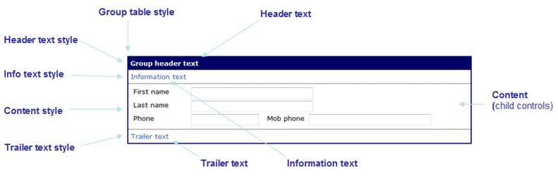
A Group Control has three texts – header text, information text, trailer text – and these texts and any child controls are displayed in a tabular layout. Child controls are displayed in the content area between the information text and trailer text and are laid out according to the selected layout configured for the control.
The diagram below shows the advanced properties available:
Hints and Tips
Control overflows to the right
The Group Panel Control seems to break out of the parent control space. This problem typically occurs when a left margin has been configured for the Group Panel Control. Click here for solutions to this problem.
Right Click Menu Actions
Click here for right-click menu actions available to all controls.
There are no specific right click actions for this control.
Appearance in Outline View
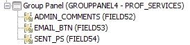
A Group Panel Control is shown with the control name in brackets.
For forms migrated from an Ebase version prior to Version 4.0, the original group name is shown after the control name (PROF_SERVICES in the example below); this name can be used in hide group and show group FPL commands.