Button Control
See also: Styling Assistants, Introduction to Styling, Controls, Layouts
Description
A Button Control represents a button that can be clicked by the user. When the user clicks the button, the on click event is executed on the server. Alternatively, click and keypress events can be added using HTML Element Properties and the event can be handled using client-side Javascript.
Button Controls can operate in two modes:
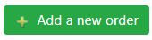
- No children: when the Button Control has no child controls, the text in the Button Text property is enabled and this is displayed using HTML input type=’submit’.
- With children: when the Button Control has one or more child controls (usually Text Controls and Image Controls), the Button Text property is disabled and is not used. Instead the control is rendered using the child controls – with the expectation that any text will be included in a Text Control. This provides the opportunity to create a button that is more than just a simple text. The Button Control is displayed using the HTML <button> tag.
The following controls can be added as child controls: Text Control, Image Control, HTML Control, Canvas Control. If an HTML Control is used, it should not contain anything interactive.
When adding the first child Text Control, the system will automatically copy the text configured in the Button Text property . When adding an Image Control or a Canvas Control, an additional Text Control is also created if one doesn’t already exist and the Button Text property is configured.
Properties
See also control common properties and local/inherited control properties.
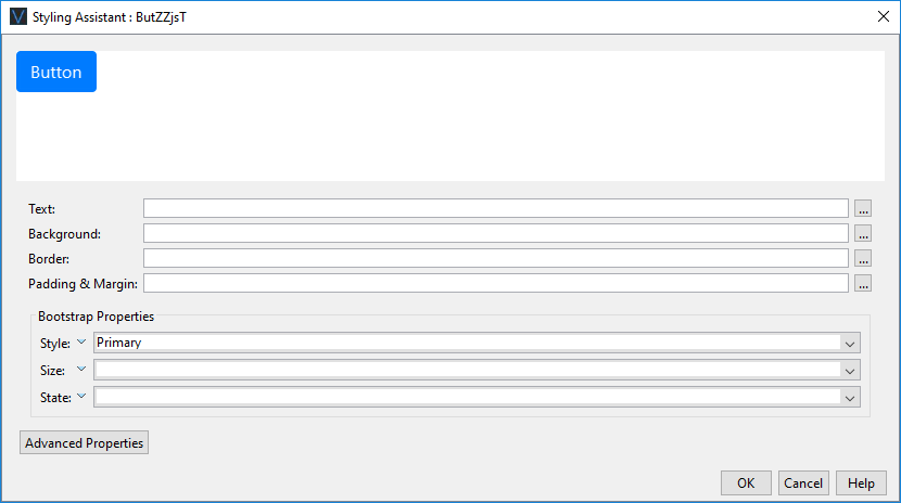
Style Tab - Styling Assistant
|
|
Description |
Name1 |
Type1 |
Get1 |
Set1 |
Get/Set
Values1 |
|
Text |
Properties for the button text. See text properties. |
|
|
|
|
|
|
Background |
Properties for the button background. See background properties. |
|
|
|
|
|
|
Border |
Properties for the button border. See border properties. |
|
|
|
|
|
|
Padding & Margin |
Padding is the space between the button’s border and its text. Margin is the space beyond the border. See padding and margin properties. Top and bottom margin properties are not supported. Specify these by wrapping the Text Control in a Panel Control and add the margin properties to this. Alternatively, use a Spacer Control. |
|
|
|
|
|
|
|
|
|
|
|
|
|
|
Style |
CSS class and inline style for the button. |
cssClass style |
Character |
Yes |
Yes |
As per HTML class parameter As per HTML style parameter |
Bootstrap
These properties are only available when a form is configured to use bootstrap i.e. the framework property in Form Properties is configured to use bootstrap (by default this property is inherited from the Presentation Template).
See Using Bootstrap with Verj.io.
|
Property |
Description |
Name1 |
Type1 |
Get1 |
Set1 |
Get/Set Values1 |
|
Style |
Sets the Bootstrap style. This results in the addition of the appropriate bootstrap classes. |
bootstrapStyle |
Character |
Yes |
Yes |
Primary Secondary Success Danger Warning Info Light Dark Link Outline Primary Outline Secondary Outline Success Outline Danger Outline Warning Outline Info Outline Light Outline Dark |
|
Size |
Sets the Bootstrap size. This results in the addition of the appropriate bootstrap classes. |
bootstrapSize |
Character |
Yes |
Yes |
Large Small |
|
State |
Sets the Bootstrap state. This results in the addition of the appropriate bootstrap classes. |
bootstrapState |
Character |
Yes |
Yes |
Active Disabled |
Html Element Properties Tab
This allows you to add element properties to the root element of the Control – see Html Element Properties for more information.
Button Control tab
|
Property |
Description |
Name1 |
Type1 |
Get1 |
Set1 |
Get/Set Values1 |
|
Skip validation |
Specifies that the system will omit all validation prior to executing the on click event. See skip validation for details. |
skipValidation |
Boolean |
Yes |
Yes |
|
|
Disabled |
Disables the button by adding the disabled HTML attribute. Most browsers typically display this using a dimmer color. When disabled, no user interaction is possible and no events will be fired. |
disabled |
Boolean |
Yes |
Yes |
|
Events Tab
|
Property |
Description |
Name1 |
Type1 |
Get1 |
Set1 |
Get/Set Values1 |
|
On Click |
This event is executed when the user clicks the button. Any applicable validation events are run before the on click event. If a validation event fails, the on click event is not executed. See Events for more information. |
|
|
No |
No |
|
Texts tab
|
Property |
Description |
Name1 |
Type1 |
Get1 |
Set1 |
Get/Set Values1 |
|
Button Text |
The text displayed in the button. This text is only applicable when the Button Control does not have any child controls. |
buttonText |
Character |
Yes |
Yes |
|
|
Mouse Over Text |
Text displayed to the user when the mouse is moved over the button |
mouseOverText |
Character |
Yes |
Yes |
|
1 See accessing control properties from scripts
Examples of setting properties via Javascript
controls.BUTTON1.textColor
= "#FF0099";
controls.BUTTON1.backgroundColor
= "yellow";
controls.BUTTON1.buttonText.text
= "Try me";
controls.BUTTON1.disabled
= true;
Examples of setting properties via FPL:
set BUTTON1.textColor = '#FF0099';
set BUTTON1.backgroundColor = 'yellow';
set BUTTON1.buttonText = 'Try me';
Right Click Menu Actions
Click here for right-click menu actions available to all controls.
There are no specific right click actions for this control.
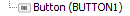
Appearance in Outline View
A Button Control is shown with the control name in brackets: