Button Column Control
See also: Table Control, Table Basics, Tables Tutorial, Controls, Introduction to Styling, Styling Assistants, Controls, Button Control
Description
A Button Column Control represents a button in a table column that can be clicked by the user. When the user clicks the button, the on click event scripts are executed on the server. Alternatively, click and keypress events can be added using HTML Element Properties and the event can be handled using client-side Javascript. This control is largely the same as a Button Control and shares the same properties.
Button Column Controls can operate in two modes:
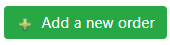
- No children: when the Button Column Control has no child controls, the text in the Button Text property is enabled and this is displayed using HTML input type=’submit’.
- With children: when the Button Column Control has one or more child controls (usually Text Controls and Image Controls), the Button Text property is disabled and is not used. Instead the control is rendered using the child controls – with the expectation that any text will be included in a Text Control. This provides the opportunity to create a button that is more than just a simple text. The Button Control is displayed using the HTML <button> tag.
The following controls can be added as child controls: Text Control, Image Control, HTML Control, Canvas Control. If an HTML Control is used, it should not contain anything interactive.
When adding the first child Text Control, the system will automatically copy the text configured in the Button Text property. When adding an Image Control or a Canvas Control, an additional Text Control is also created if one doesn’t already exist and the Button Text property is configured.
Properties
See also control common properties and local/inherited control properties.
Style Tab – Styling Assistant
The properties and the Interactive Preview are divided into sections that represent different parts of a Button Column Control. Each section can be selected from the Edit Properties dropdown or by clicking on the appropriate area in the preview. The sections are:
- Column – properties for the table cells
- Column Header – properties for the header
- Button – properties for the button
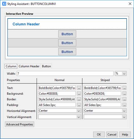
These properties override the default table column properties specified using the Table Control Styling Assistant.
|
Property |
Description |
Name1 |
Type1 |
Get1 |
Set1 |
Get/Set Values1 |
Column |
The following properties apply to the table column cell data |
|
|
|
|
|
|
Width |
Sets the width of the table column. It is recommended that the same width unit is used for all columns within a table. |
width |
Character |
Yes |
Yes |
As per CSS width property |
|
|
||||||
|
Text |
Text properties for the table column: font, size, color, bold, italic etc. See text properties. |
|
|
|
|
|
|
Background |
Cell background properties for the table column. See background properties. If table striping is specified on the Table Control, the corresponding striped property should also be set. |
|
|
|
|
|
|
Border |
Border properties for the table column. See border properties. |
|
|
|
|
|
|
Padding |
Padding is the space between the table cell contents and the border. See padding and margin properties. |
|
|
|
|
|
|
Horizontal Alignment |
Horizontal alignment of the table cell contents. |
hAlign |
Character |
Yes |
Yes |
Click here for values. Value Fill is not supported. |
|
Vertical Alignment |
Vertical alignment of the table cell contents. |
vAlign |
Character |
Yes |
Yes |
Click here for values. Value Fill is not supported. |
|
Striped: these properties apply to alternate rows. |
||||||
|
Text |
Text properties for the table column: font, size, color, bold, italic etc. See text properties. |
stripeProperties .xxx |
|
|
|
|
|
Background |
Cell background properties for the table column. See background properties. |
stripeProperties .xxx |
|
|
|
|
|
Border |
Border properties for the table column. See border properties. |
stripeProperties .xxx |
|
|
|
|
|
Padding |
Padding is the space between the table cell contents and the border. See padding and margin properties. |
stripeProperties .xxx |
|
|
|
|
|
Alignment |
Horizontal alignment of the table cell contents. |
stripeProperties .hAlign |
Character |
Yes |
Yes |
Click here for values. Value Fill is not supported. |
|
Vertical Alignment |
Vertical alignment of the table cell contents. |
stripeProperties .vAlign |
Character |
Yes |
Yes |
Click here for values. Value Fill is not supported. |
|
|
|
|
|
|
|
|
|
Cell style |
CSS class and inline style applied to the table cells used to present this table column. |
columnCellClass columnCellStyle |
Character |
Yes |
Yes |
As per HTML class parameter As per HTML style parameter |
|
Data style |
CSS class and inline style applied to the table cell data for this column. |
columnDataClass columnDataStyle |
Character |
Yes |
Yes |
As per HTML class parameter As per HTML style parameter |
Column Header |
The following properties apply to the column header |
|
|
|
|
|
|
Text |
Text properties for the column header: font, size, color, bold, italic etc. See text properties. |
columnHeaderProperties .xxx |
|
|
|
|
|
Background |
Column header background properties. See background properties. |
columnHeaderProperties .xxx |
|
|
|
|
|
Border |
Border properties for the column header. See border properties. |
columnHeaderProperties .xxx |
|
|
|
|
|
Padding |
Padding is the space between the column header text and its border. See padding and margin properties. |
columnHeaderProperties .xxx |
|
|
|
|
|
Alignment |
Horizontal alignment of the column header. |
columnHeaderProperties .hAlign |
Character |
Yes |
Yes |
Click here for values. Value Fill is not supported. |
Button |
The following properties apply to the button |
|
|
|
|
|
|
Width |
The button width. |
buttonWidth |
Character |
Yes |
Yes |
As per CSS width property |
|
|
||||||
|
Text |
Text properties for the button: font, size, color, bold, italic etc. See text properties. |
buttonProperties .xxx |
|
|
|
|
|
Background |
Cell background properties for the button. See background properties. |
buttonProperties .xxx |
|
|
|
|
|
Border |
Border properties for the button. See border properties. |
buttonProperties .xxx |
|
|
|
|
|
Padding |
Padding is the space between the button text and its border. See padding and margin properties. |
buttonProperties .xxx |
|
|
|
|
|
Striped: these properties apply to alternate rows. |
||||||
|
Text |
Text properties for the button: font, size, color, bold, italic etc. See text properties. |
stripedButtonProperties .xxx |
|
|
|
|
|
Background |
Cell background properties for the button. See background properties. |
stripedButtonProperties .xxx |
|
|
|
|
|
Border |
Border properties for the button. See border properties. |
stripedButtonProperties .xxx |
|
|
|
|
|
Padding |
Padding is the space between the button text and its border. See padding and margin properties. |
stripedButtonProperties .xxx |
|
|
|
|
|
Bootstrap: These properties are only available when a form is configured to use bootstrap i.e. the framework property in Form Properties is configured to use bootstrap (by default this property is inherited from the Presentation Template). See Using Bootstrap with Verj.io. |
||||||
|
Style |
Sets the Bootstrap style. This results in the addition of the appropriate bootstrap classes. |
bootstrapStyle |
Character |
Yes |
Yes |
Primary Secondary Success Danger Warning Info Light Dark Link Outline Primary Outline Secondary Outline Success Outline Danger Outline Warning Outline Info Outline Light Outline Dark |
|
Size |
Sets the Bootstrap size. This results in the addition of the appropriate bootstrap classes. |
bootstrapSize |
Character |
Yes |
Yes |
Large Small |
|
State |
Sets the Bootstrap state. This results in the addition of the appropriate bootstrap classes. |
bootstrapState |
Character |
Yes |
Yes |
Active Disabled |
Html Element Properties Tab
See Html Element Properties Assistant for more information about these properties.
In addition to its Root Element, Html Element Properties can be configured for every button in the column. The Button Column Control is a repeating element and so the Id Html Element Property is disabled for every element in the Control.
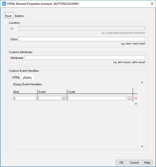
Root Tab
A Button Column Control consists of a th element (if column headers are enabled - see Table Control) plus a collection td elements, one for each row. The Root Element is all of these td elements along with the th element; the same Html Element Properties are applied to each of its Root elements.
Button Tab
The Button is an input element (with type=submit) and the Html Element Properties are applied to each one of them in the column.
Button Control tab
|
Property |
Description |
Name1 |
Type1 |
Get1 |
Set1 |
Get/Set Values1 |
|
Skip validation |
Specifies that the system will omit all validation prior to executing the on click event. See skip validation for details. |
skipValidation |
Boolean |
Yes |
Yes |
|
|
Disabled |
Disables the button by adding the disabled HTML attribute. Most browsers typically display this using a dimmer color. When disabled, no user interaction is possible and no events will be fired. |
disabled |
Boolean |
Yes |
Yes |
|
Events Tab
|
Property |
Description |
Name1 |
Type1 |
Get1 |
Set1 |
Get/Set Values1 |
|
On Click |
This event is executed when the user clicks the button. Any applicable validation events are run before the on click event. If a validation event fails, the on click event is not executed. See Events for more information. |
|
|
No |
No |
|
Texts tab
|
Description |
Name1 |
Type1 |
Get1 |
Set1 |
Get/Set
Values1 |
|
|
Button Text |
The text displayed in the button. |
buttonText |
Character |
Yes |
Yes |
|
|
Mouse Over Text |
Text displayed to the user when the mouse is moved over the button |
mouseOverText |
Character |
Yes |
Yes |
|
Column Heading Tab
|
Property |
Description |
Name1 |
Type1 |
Get1 |
Set1 |
Get/Set
Values1 |
|
Heading Text |
Column header text. |
headerText |
Character |
Yes |
Yes |
|
1 See accessing control properties from scripts
Examples of setting properties via API based language:
controls.BUTTONCOLUMN1.width
= "80px";
controls.BUTTONCOLUMN1.buttonWidth
= "60px";
controls.BUTTONCOLUMN1.textColor
= "#000000";
controls.BUTTONCOLUMN1.stripeProperties.textColor
= "#000000";
controls.BUTTONCOLUMN1.columnHeaderProperties.textColor
= "#000000";
controls.BUTTONCOLUMN1.buttonProperties.backgroundColor
= "red";
controls.BUTTONCOLUMN1.buttonText.text
= "Click me please";
controls.BUTTONCOLUMN1.headerText.text
= "Act now";
Examples of setting properties via FPL:
set
BUTTONCOLUMN1.width = '80px';
set
BUTTONCOLUMN1.buttonWidth = '60px';
set
BUTTONCOLUMN1.textColor = '#000000';
set BUTTONCOLUMN1.stripeProperties.textColor
= '#000000';
set
BUTTONCOLUMN1.columnHeaderProperties.textColor = '#000000';
set
BUTTONCOLUMN1.buttonProperties.backgroundColor = 'red';
set
BUTTONCOLUMN1.buttonText = 'Click me please';
set
BUTTONCOLUMN1.headerText = 'Act now';
Right Click Menu Actions
Click here for right-click menu actions available to all controls.
There are no specific right click actions for this control.
Appearance in Outline View
A Button Column Control is shown with the control name in brackets: