List Control
See also: Working with Lists
Description
A List Control is used to display some sort of dynamic content which is configured in a List Model. The list items can be displayed as an ordered or unordered list and list items can be displayed as simple texts or as hyperlinks. A List Control has a single child List Item Control, which in turn can contain a List Text Control (to display list items as simple texts) or a List Hyperlink Control (to display list items as hyperlinks). The List Control works by rendering the List Item and any children repeatedly for each item in the list model.
The list model can be configured to be either a Static List or a Dynamic List or the model can be supplied via a script e.g.
//
create simple list with three entries
var list1 = ["Line 1", "Line 2",
"Line 3"];
controls.myList1.createCustomList(list1);
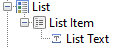
When you
first drag a List Control onto a page, three controls including a List Text Control are added – this List
Text Control displays the list item text for the current row of the list.
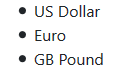
For example
a currency list is now displayed like this:
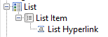
To display
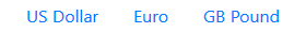
the items as hyperlinks, remove the List Text Control and replace it with a
List Hyperlink Control:
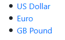
The list is
now displayed like this:
Here is the
same list, now styled as a Bootstrap Nav menu:
See Working with Lists for more information.
Properties
See also control common properties and local/inherited control properties.
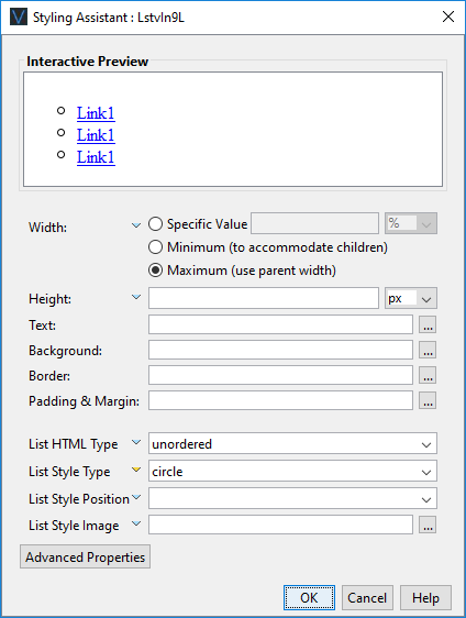
Style Tab - Styling Assistant
|
Property |
Description |
Name1 |
Type1 |
Get1 |
Set1 |
Get/Set Values1 |
|
Width |
Sets the width to one of the following: · A specific value e.g. 300px · The minimum value: this results in the control being just as wide as it needs to be to accommodate its children. · The maximum value: the width is taken from the parent container control. This width will then include the control plus any configured padding, border or margins. Note that this setting will be ignored if the parent container layout specifies a horizontal cell alignment of fill (this applies to Horizontal Box, Vertical Box and Column layouts). This is equivalent to specifying maximum above. Warning: when a specific value is set, any padding, border or margins will be in addition to the specified value and can cause the control to “break out” of its parent space. In particular, try and avoid specifying a width of 100%; use maximum instead. See also: understanding width. |
width |
Character |
Yes |
Yes |
As per CSS width property null: equivalent to maximum Child: equivalent to minimum |
|
Height |
Sets the height. See understanding height. |
height |
Character |
Yes |
Yes |
As per CSS height property |
|
Text |
Sets the text properties for any child controls: font, size, color, bold, italic etc. See text properties. |
|
|
|
|
|
|
Background |
See background properties. |
|
|
|
|
|
|
Border |
Border properties for the control. See border properties. |
|
|
|
|
|
|
Padding & Margin |
Padding is the space inside the border. Margin is the space beyond the border. See padding and margin properties. |
|
|
|
|
|
|
|
|
|
|
|
|
|
|
List HTML Type |
Select unordered for an unordered list (<ul> tag), ordered for an ordered list (<ol> tag). |
containingListType |
Character |
Yes |
Yes |
ordered or unordered |
|
List Style Type |
Provides the bullet or number format for the list. |
listStyleType |
Character |
Yes |
Yes |
As per CSS list-style-type property |
|
List Style Position |
|
listStylePosition |
Character |
Yes |
Yes |
As per CSS list-style-position property |
|
List Style Image |
Specifies the URL of the list item marker using the CSS list-style-image property. See URL properties for more information. |
listStyleImage |
Character |
Yes |
Yes |
|
|
|
|
|
|
|
|
|
|
|
|
|
|
|
|
|
|
Style |
CSS class and inline style for the control. |
cssClass style |
Character |
Yes |
Yes |
As per HTML class parameter As per HTML style parameter |
Html Element Properties Tab
This allows you to add element properties to the root element of the Control – see Html Element Properties for more information.
List Model Tab
|
Property |
Description |
Name1 |
Type1 |
Get1 |
Set1 |
Get/Set Values1 |
|
Static List |
Configures the Static List to be used as the list model |
layout |
Character |
Yes |
No |
|
|
Dynamic List |
Configures the Dynamic List to be used as the list model |
|
Character |
Yes |
No |
|
|
Display Field |
Configures which field within the Dynamic List should be displayed |
|
Character |
Yes |
No |
|
1 See accessing control properties from scripts
Examples of setting properties from scripts:
|
FPL: |
Javascript: |
|
set myList1.width
= '1000px'; set
myList1.listStyleType = 'circle'; set
myList1.containingListType = 'unordered'; |
controls.myList1.listStyleType
= "circle"; controls.myList1.containingListType
= "unordered"; |