Vertical Menu Control
See also: Menu Structures, Menu Programming, Sharing Menus, Horizontal Menu Control, Menu Item Control, Dynamic Menu Item Control, Menus - Advanced Styling, Controls
Introduction
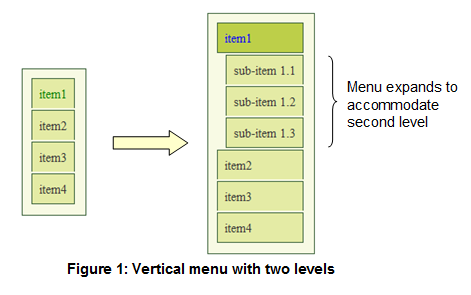
A Vertical Menu Control represents a menu where the top level is shown vertically; Subsequent levels can also be shown vertically with the menu expanding to accommodate them, or they can be shown as dynamic drop out menus in the same way as for a Horizontal Menu Control. A Vertical Menu Control could be used as a traditional menu where the user clicks an item to request an action or open a sub-menu, or alternatively it could be used as a navigator to show location in a website or progress through a form: when used as a navigator, each menu item can be clickable or not as required.
The main features of a Vertical Menu Control are:
- Any number of menu levels are supported.
- The top menu level is shown vertically. Subsequent levels can also be shown vertically with the menu expanding to accommodate them, or they can be shown as dynamic drop out menus in the same way as for a Horizontal Menu Control.
- Each menu item can contain a text and/or an image.
- Each menu item can be clicked which then runs an event and/or opens a sub-menu. A single menu-level event can be shared by all items, or events can be specified individually for each menu item. See Menu Programming.
- Each menu item can be disabled, meaning that it cannot be clicked by the user.
- The menu can be shared between pages and between forms. See Sharing Menus.
- When an item is selected, all parent items can optionally also be marked as selected.
- The selected item of a menu can be set programmatically. See Menu Programming.
The menu structure is created by adding Menu Item Controls and/or Dynamic Menu Item Controls as children of a Vertical Menu Control. Click here for more information on menu structures.
Properties
See also control common properties and local/inherited control properties.
Menu Terms
A leaf item refers to a menu item with no children.
A non-leaf item refers to a menu item with children.
Runtime only properties
|
Property |
Description |
Name1 |
Type1 |
Get1 |
Set1 |
Get/Set
Values1 |
|
Selected
menu item |
Contains the name of the currently
selected menu item. This can be used to determine which menu item has been
clicked, or to set a menu item as selected. See Menu Programming. |
selected |
Character |
Yes |
Yes |
|
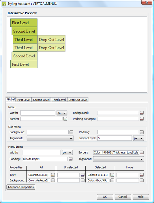
Style Tab – Styling Assistant
The properties and the Interactive Preview are divided into sections that represent different parts of a Vertical Menu Control. Each section can be selected from the Edit Properties dropdown or by clicking on the appropriate area in the preview. The sections are:
- Global – properties for the entire menu plus menu item properties that apply to both the top level and drop out levels
- First Level, Second Level, Third Level etc. - properties for menu levels that are displayed vertically. The number of sections available matches the Levels Before Dropdown property. These override any properties configured at the global level.
- Drop Out - properties for just the drop out levels. These override any properties configured at the global level.
|
Property |
Description |
Name1 |
Type1 |
Get1 |
Set1 |
Get/Set
Values1 |
Global |
The following properties apply to the entire menu |
|
|
|
|
|
|
Menu: these properties apply to the entire menu. Note that drop out
menu levels are displayed outside of this container. |
||||||
|
Width |
Sets the width for the entire menu excluding drop out levels. If not specified, the menu will be as wide as it needs to be to accommodate its child menu items. Warning: any margins will be in addition to the specified value and can cause the Menu Control to “break out” of its parent space. Click here for further info. See also: understanding width. |
width |
Character |
Yes |
Yes |
As per CSS width property |
|
Background |
Background properties for the entire menu. See background properties. Note that this does not include drop out menu levels. |
|
|
|
|
|
|
Border |
Border properties for the entire menu. See border properties. Note that this does not include drop out menu levels. |
|
|
|
|
|
|
Padding & Margin |
These properties apply to the entire menu bar. Padding is the space between the menu items and the menu border. Margin is the space beyond the border. See padding and margin properties. Note that this does not include drop out menu levels. |
|
|
|
|
|
|
Sub Menu: common properties that apply to the container for each menu
level (equivalent to a <ul> HTML tag). These can be overridden using
the individual
menu level sections. |
||||||
|
Background |
Background properties for the menu containers at each level except the drop out level. See background properties. |
globalLevel .levelBackground .xxx |
|
|
|
|
|
Padding |
Border properties for the menu containers at each level except the drop out level. See border properties. |
globalLevel .levelPadding .xxx |
|
|
|
|
|
Alignment |
Horizontal alignment of the content (menu items) within each menu level container. For this property to be effective, menu item widths need to be set to a value less than the width of the menu container. |
globalLevel .subMenuHAlign |
|
|
|
|
|
Indent Level |
Supplies a left indent for the menu contents within each menu container. |
globalLevel .indent |
Character |
Yes |
Yes |
As per CSS width property |
|
Menu Items: common properties for all menu items, including all levels. These can be overridden using the individual menu level sections or drop out level section. |
||||||
|
Width |
Sets the width for all menu items. If the width is not sufficient to accommodate the content of a menu item, it will overflow. If no width is specified, each top level menu item will be as wide as it needs to be to accommodate its content. For drop out menu levels, the width of all items in each level is set to the width of the widest item. |
globalLevel .itemWidth |
Character |
Yes |
Yes |
As per CSS width property |
|
Border |
Border properties for each menu item. See border properties. |
globalLevel .itemBorder .xxx |
|
|
|
|
|
Padding |
Padding is the space between the contents of a menu item and its border. See padding and margin properties. |
globalLevel .itemPadding .xxx |
|
|
|
|
|
Alignment |
Horizontal alignment of the content within each menu item. |
globalLevel .hAlign |
Character |
Yes |
Yes |
Click here for values. Value Fill is not supported. |
|
Each menu item represents a link that can have multiple states, and the following group of properties correspond with each of these states, plus a set of default properties that apply to all states unless specifically overridden. The link states are:
|
||||||
|
These properties apply to all states unless overridden by a property for a specific state. They apply to all menu items at all levels. |
||||||
|
Text |
Text properties for each menu item: font, size, color, bold, italic etc. See text properties. |
globalLevel .allState .xxx |
|
|
|
|
|
Background |
Background properties for each menu item. See background properties. |
globalLevel .allState .xxx |
|
|
|
|
|
These properties apply to the unselected
state (the menu item has not been clicked by the user). They apply to all menu items at all levels. |
||||||
|
Text |
Text properties for each menu item: font, size, color, bold, italic etc. See text properties. |
globalLevel .normalState .xxx |
|
|
|
|
|
Background |
Background properties for each menu item. See background properties. |
globalLevel .normalState .xxx |
|
|
|
|
|
These properties apply to the selected
state (the menu item has already been clicked by the user). They apply to all menu items at all levels. |
||||||
|
Text |
Text properties for each menu item: font, size, color, bold, italic etc. See text properties. |
globalLevel .selectedState .xxx |
|
|
|
|
|
Background |
Background properties for each menu item. See background properties. |
globalLevel .selectedState .xxx |
|
|
|
|
|
These properties apply to the hover
state (the mouse is moved over the menu item). They apply to all menu items at all levels. |
||||||
|
Text |
Text properties for each menu item: font, size, color, bold, italic etc. See text properties. |
globalLevel .hoverState .xxx |
|
|
|
|
|
Background |
Background properties for each menu item. See background properties. |
globalLevel .hoverState .xxx |
|
|
|
|
|
|
|
|
|
|
|
|
|
Style |
CSS class and inline style applied to the menu container. |
cssClass sStyle |
Character |
Yes |
Yes |
As per HTML class parameter As per HTML style parameter |
|
|
|
|
|
|
|
|
First LevelSecond Level Third Level Fourth Level |
The following properties apply to menu items at one specific level
and override any menu item properties set in the Global section. The number of sections available depends on the Levels Before Dropdown property |
Change nthLevel below to: ·
firstLevel ·
secondLevel ·
thirdLevel · fourthLevel |
|
|
|
|
|
Sub Menu: properties that apply to the container for the menu level (equivalent to a <ul> HTML tag). |
||||||
|
Background |
Background properties for the menu container. See background properties. |
nthLevel .levelBackground .xxx |
|
|
|
|
|
Padding |
Border properties for the menu containers. See border properties. |
nthLevel .levelPadding .xxx |
|
|
|
|
|
Alignment |
Horizontal alignment of the content (menu items) within the menu level container. For this property to be effective, menu item widths need to be set to a value less than the width of the menu container. |
nthLevel .subMenuHAlign |
|
|
|
|
|
Indent Level |
Supplies a left indent for the menu contents within the menu container. |
nthLevel .indent |
Character |
Yes |
Yes |
As per CSS width property |
|
Menu Items: menu item properties for the level. These override any properties set at the global level. |
||||||
|
Width |
Sets the width for all menu items. If the width is not sufficient to accommodate the content of a menu item, it will overflow. If no width is specified, each top level menu item will be as wide as it needs to be to accommodate its content. |
nthLevel .itemWidth |
Character |
Yes |
Yes |
As per CSS width property |
|
Border |
Border properties for each menu item. See border properties. |
nthLevel .itemBorder .xxx |
|
|
|
|
|
Padding |
Padding is the space between the contents of a menu item and its border. See padding and margin properties. |
nthLevel .itemPadding .xxx |
|
|
|
|
|
Alignment |
Horizontal alignment of the content within each menu item. |
nthLevel .hAlign |
Character |
Yes |
Yes |
Click here for values. Value Fill is not supported. |
|
Each menu item represents a link that can have multiple states, and the following group of properties correspond with each of these states, plus a set of default properties that apply to all states unless specifically overridden. The link states are:
|
||||||
|
These properties apply to all menu item states unless overridden by a property for a specific state. |
||||||
|
Text |
Text properties for each menu item: font, size, color, bold, italic etc. See text properties. |
nthLevel .allState .xxx |
|
|
|
|
|
Background |
Background properties for each menu item. See background properties. |
nthLevel .allState .xxx |
|
|
|
|
|
These properties apply menu items in the unselected state (the menu item has not been clicked by the
user). |
||||||
|
Text |
Text properties for each menu item: font, size, color, bold, italic etc. See text properties. |
nthLevel .normalState .xxx |
|
|
|
|
|
Background |
Background properties for each menu item. See background properties. |
nthLevel .normalState .xxx |
|
|
|
|
|
These properties apply to menu items in the selected state (the menu item has already been clicked by the
user). |
||||||
|
Text |
Text properties for each menu item: font, size, color, bold, italic etc. See text properties. |
nthLevel .selectedState .xxx |
|
|
|
|
|
Background |
Background properties for each menu item. See background properties. |
nthLevel .selectedState .xxx |
|
|
|
|
|
These properties apply to menu items in the hover state (the mouse is moved over the menu item). |
||||||
|
Text |
Text properties for each menu item: font, size, color, bold, italic etc. See text properties. |
nthLevel .hoverState .xxx |
|
|
|
|
|
Background |
Background properties for each menu item. See background properties. |
nthLevel .hoverState .xxx |
|
|
|
|
|
|
Change nthLevel below to: ·
topLevel ·
secondLevel ·
thirdLevel · fourthLevel |
|
|
|
|
|
|
Level Background |
CSS class and inline style applied to the background of the first menu level. See Menus - Advanced Styling for further information. |
nthLevelBackgroundClass nthLevelBackgroundStyle |
Character |
Yes |
Yes |
As per HTML class parameter As per HTML style parameter |
|
nth
Level Items With Children: |
||||||
|
Unselected Style |
CSS class and inline style applied to unselected non-leaf menu items. See Menus - Advanced Styling for further information. |
nthLevelClass nthLevelStyle |
Character |
Yes |
Yes |
As per HTML class parameter As per HTML style parameter |
|
Unselected Text Style |
CSS class and inline style applied to unselected non-leaf menu texts. See Menus - Advanced Styling for further information. |
nthLevelTextClass nthLevelTextStyle |
Character |
Yes |
Yes |
As per HTML class parameter As per HTML style parameter |
|
Selected Style |
CSS class and inline style applied to selected non-leaf menu items. See Menus - Advanced Styling for further information. |
nthLevelSelectedClass nthLevelSelectedStyle |
Character |
Yes |
Yes |
As per HTML class parameter As per HTML style parameter |
|
Selected Text Style |
CSS class and inline style applied to selected non-leaf menu texts. See Menus - Advanced Styling for further information. |
nthLevelSelectedTextClass nthLevelSelectedTextStyle |
Character |
Yes |
Yes |
As per HTML class parameter As per HTML style parameter |
|
Hover Style |
CSS inline style applied to menu items when the mouse is hovered over the item. See Menus - Advanced Styling for further information. |
nthLevellHoverStyle |
Character |
Yes |
Yes |
As per HTML class parameter As per HTML style parameter |
|
Hover Text Style |
CSS inline style applied menu texts when the mouse is hovered over the item. See Menus - Advanced Styling for further information. |
nthLevelHoverTextStyle |
Character |
Yes |
Yes |
As per HTML class parameter As per HTML style parameter |
|
nth Level Items With No Children: |
||||||
|
Unselected Style |
CSS class and inline style applied to unselected leaf menu items. See Menus - Advanced Styling for further information. |
nthLevelLeafClass nthLevelLeafStyle |
Character |
Yes |
Yes |
As per HTML class parameter As per HTML style parameter |
|
Unselected Text Style |
CSS class and inline style applied to unselected leaf menu texts. See Menus - Advanced Styling for further information. |
nthLevelLeafTextClass nthLevelLeafTextStyle |
Character |
Yes |
Yes |
As per HTML class parameter As per HTML style parameter |
|
Selected Style |
CSS class and inline style applied to selected leaf menu items. See Menus - Advanced Styling for further information. |
nthLevelLeafSelectedClass nthLevelLeafSelectedStyle |
Character |
Yes |
Yes |
As per HTML class parameter As per HTML style parameter |
|
Selected Text Style |
CSS class and inline style applied to selected leaf menu texts. See Menus - Advanced Styling for further information. |
nthLevelLeafSelectedTextClass nthLevelLeafSelectedTextStyle |
Character |
Yes |
Yes |
As per HTML class parameter As per HTML style parameter |
|
Hover Style |
CSS inline style applied to menu items when the mouse is hovered over the item. See Menus - Advanced Styling for further information. |
nthLevelLeafHoverStyle |
Character |
Yes |
Yes |
As per HTML class parameter As per HTML style parameter |
|
Hover Text Style |
CSS inline style applied menu texts when the mouse is hovered over the item. See Menus - Advanced Styling for further information. |
nthLevelLeafHoverTextStyle |
Character |
Yes |
Yes |
As per HTML class parameter As per HTML style parameter |
|
|
|
|
|
|
|
|
Drop Out |
The following properties apply to all drop out level menu items and override any menu item properties set in the Global section. |
|
|
|
|
|
|
Menu Items: properties for drop out menu items. |
||||||
|
Width |
Sets the width for all menu items. If the width is not sufficient to accommodate the content of a menu item, it will overflow. If no width is specified, the width of all items in each level is set to the width of the widest item. |
subLevel .itemWidth |
Character |
Yes |
Yes |
As per CSS width property |
|
Border |
Border properties for each menu item. See border properties. |
subLevel .itemBorder .xxx |
|
|
|
|
|
Padding |
Padding is the space between the contents of a menu item and its border. See padding and margin properties. |
subLevel .itemPadding .xxx |
|
|
|
|
|
Alignment |
Horizontal alignment of the content within each menu item. |
subLevel .hAlign |
Character |
Yes |
Yes |
Click here for values. Value Fill is not supported. |
|
Each menu item represents a link that can have multiple states, and the following group of properties correspond with each of these states, plus a set of default properties that apply to all states unless specifically overridden. The link states are:
|
||||||
|
These properties apply to all drop out menu item states unless overridden by a property for a specific state. |
||||||
|
Text |
Text properties for each menu item: font, size, color, bold, italic etc. See text properties. |
subLevel .allState .xxx |
|
|
|
|
|
Background |
Background properties for each menu item. See background properties. |
subLevel .allState .xxx |
|
|
|
|
|
These properties apply to drop out menu items in the unselected state (the menu item has not been clicked by the user). |
||||||
|
Text |
Text properties for each menu item: font, size, color, bold, italic etc. See text properties. |
subLevel .normalState .xxx |
|
|
|
|
|
Background |
Background properties for each menu item. See background properties. |
subLevel .normalState .xxx |
|
|
|
|
|
These properties apply to drop out menu items in the selected state ((the menu item has already been clicked by the user). |
||||||
|
Text |
Text properties for each menu item: font, size, color, bold, italic etc. See text properties. |
subLevel .selectedState .xxx |
|
|
|
|
|
Background |
Background properties for each menu item. See background properties. |
subLevel .selectedState .xxx |
|
|
|
|
|
These properties apply to drop out menu items in the hover state ( the mouse is moved over the menu item). |
||||||
|
Text |
Text properties for each menu item: font, size, color, bold, italic etc. See text properties. |
subLevel .hoverState .xxx |
|
|
|
|
|
Background |
Background properties for each menu item. See background properties. |
subLevel .hoverState .xxx |
|
|
|
|
|
|
|
|
|
|
|
|
|
Level Background |
CSS class and inline style applied to the background of the first menu level. See Menus - Advanced Styling for further information. |
backgroundClass backgroundStyle |
Character |
Yes |
Yes |
As per HTML class parameter As per HTML style parameter |
|
Drop Out Items With Children: |
||||||
|
Unselected Style |
CSS class and inline style applied to unselected non-leaf menu items. See Menus - Advanced Styling for further information. |
itemClass itemStyle |
Character |
Yes |
Yes |
As per HTML class parameter As per HTML style parameter |
|
Unselected Text Style |
CSS class and inline style applied to unselected non-leaf menu texts. See Menus - Advanced Styling for further information. |
textClass textStyle |
Character |
Yes |
Yes |
As per HTML class parameter As per HTML style parameter |
|
Selected Style |
CSS class and inline style applied to selected non-leaf menu items. See Menus - Advanced Styling for further information. |
selectedClass selectedStyle |
Character |
Yes |
Yes |
As per HTML class parameter As per HTML style parameter |
|
Selected Text Style |
CSS class and inline style applied to selected non-leaf menu texts. See Menus - Advanced Styling for further information. |
selectedTextClass selectedTextStyle |
Character |
Yes |
Yes |
As per HTML class parameter As per HTML style parameter |
|
Hover Style |
CSS inline style applied to menu items when the mouse is hovered over the item. See Menus - Advanced Styling for further information. |
hoverStyle |
Character |
Yes |
Yes |
As per HTML class parameter As per HTML style parameter |
|
Hover Text Style |
CSS inline style applied menu texts when the mouse is hovered over the item. See Menus - Advanced Styling for further information. |
hoverTextStyle |
Character |
Yes |
Yes |
As per HTML class parameter As per HTML style parameter |
|
Drop Out Items With No Children: |
||||||
|
Unselected Style |
CSS class and inline style applied to unselected leaf menu items. See Menus - Advanced Styling for further information. |
leafClass leafStyle |
Character |
Yes |
Yes |
As per HTML class parameter As per HTML style parameter |
|
Unselected Text Style |
CSS class and inline style applied to unselected leaf menu texts. See Menus - Advanced Styling for further information. |
leafTextClass leafTextStyle |
Character |
Yes |
Yes |
As per HTML class parameter As per HTML style parameter |
|
Selected Style |
CSS class and inline style applied to selected leaf menu items. See Menus - Advanced Styling for further information. |
leafSelectedClass leafSelectedStyle |
Character |
Yes |
Yes |
As per HTML class parameter As per HTML style parameter |
|
Selected Text Style |
CSS class and inline style applied to selected leaf menu texts. See Menus - Advanced Styling for further information. |
leafSelectedTextClass leafSelectedTextStyle |
Character |
Yes |
Yes |
As per HTML class parameter As per HTML style parameter |
|
|
|
|
|
|
|
|
|
Hover Style |
CSS inline style applied to menu items when the mouse is hovered over the item. See Menus - Advanced Styling for further information. |
leafHoverStyle |
Character |
Yes |
Yes |
As per HTML class parameter As per HTML style parameter |
|
Hover Text Style |
CSS inline style applied menu texts when the mouse is hovered over the item. See Menus - Advanced Styling for further information. |
leafHoverTextStyle |
Character |
Yes |
Yes |
As per HTML class parameter As per HTML style parameter |
Html Element Properties Tab
This allows you to add element properties to the root element of the Control – see Html Element Properties for more information.
Events tab
|
Property |
Description |
Name1 |
Type1 |
Get1 |
Set1 |
Get/Set Values1 |
|
On Click |
This event is executed when any item in the menu is clicked. Note that this property can be overridden by specifying the Override On Click property for each menu item. See Menu Programming for more information. |
|
|
No |
No |
|
|
Skip Validation |
Specifies that the system will omit all validation prior to executing the on click event. See skip validation for details. |
skipValidation |
Boolean |
Yes |
Yes |
|
Menu Control tab
|
Property |
Description |
Name1 |
Type1 |
Get1 |
Set1 |
Get/Set Values1 |
|
Mark Parents Selected |
Indicates that all parent menu items are marked as selected when a menu item is clicked by the user or set as selected programmatically. For Vertical Menu Controls, this cannot be disabled. |
markParentsAsSelected |
Boolean |
Yes |
Yes |
|
|
The number of menu levels that will expand vertically. After this, subsequent menu levels will be shown as dynamic dropdowns in the same way as for a Horizontal Menu. This property also controls the number of levels that can be configured in the styling assistant e.g. if this parameter is set to 2, the First Level and Second Level can be configured; all subsequent levels are styled using the Drop Out Level tab. |
numberOfLevels |
Integer |
Yes |
Yes |
|
Menu Sharing tab
|
Property |
Description |
Name1 |
Type1 |
Get1 |
Set1 |
Get/Set Values1 |
|
Sharable |
Check this property to indicate that the menu is sharable. |
shareable |
Boolean |
Yes |
No |
|
|
Share Name |
The name that uniquely identifies the shared menu and allows other Menu Controls to share the same menu state. See Menu Sharing for more information. |
name |
Character |
Yes |
No |
|
1 See accessing control properties from scripts
Examples of setting properties via API based language:
controls.VERTICALMENU1.width
= "300px";
controls.VERTICALMENU1.globalLevel.itemWidth
= "60px";
controls.VERTICALMENU1.globalLevel.allState.backgroundColor
= "red";
controls.VERTICALMENU1.topLevel.normalState.backgroundColor
= "#FF99CC";
controls.VERTICALMENU1.topLevel.selectedState.backgroundColor
= "#CC6699";
controls.VERTICALMENU1.topLevel.hoverState.backgroundColor
= "#99CC66";
Examples of setting properties via FPL:
set
VERTICALMENU1.width = '100px';
set
VERTICALMENU1.globalLevel.itemWidth = '60px';
set
VERTICALMENU1.globalLevel.allState.backgroundColor = 'red';
set
VERTICALMENU1.firstLevel.normalState.backgroundColor = '#FF99CC';
set
VERTICALMENU1.secondLevel.selectedState.backgroundColor = '#CC6699';
set
VERTICALMENU1.subLevel.hoverState.backgroundColor = '#99CC66'; //drop out levels
See also menu programming.
Hints and Tips
1. Note that the item name (property Item name) for all Menu Item Controls within each menu must be unique, but the system does not check this. Duplicate names will cause problems with item selection.
2. There are CSS styling issues with Internet Explorer 6 that can affect the styling of menus. Click here for further details.
Right Click Menu Actions
Click here for right-click menu actions available to all controls.
There are no specific right click actions for this control.
Appearance in Outline View
A Vertical Menu Control is shown with the control name in brackets: