Horizontal Line Control
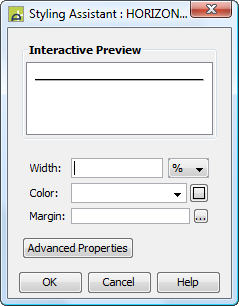
Styling Tab – Styling Assistant
See also: Introduction to Styling, Styling Assistants, Controls
Description
This control represents a horizontal line.
Properties
See also control common properties and local/inherited control properties.
Styling Tab – Styling Assistant

|
Property |
Description |
Name1 |
Type1 |
Get1 |
Set1 |
Get/Set Values1 |
|
Width |
Sets the line width. |
width |
Character |
Yes |
Yes |
As per CSS width property. |
|
Color |
Sets the line color. |
color |
Character |
Yes |
Yes |
As per CSS color property. |
|
Margin |
Margin is the space between a control and its neighbours. See margin properties. |
|
|
|
|
|
|
|
|
|
|
|
|
|
|
Style |
CSS class and inline style applied to the line. |
cssClass style |
Character |
Yes |
Yes |
As per HTML class parameter As per HTML style parameter |
1 See accessing control properties from scripts
Examples of setting properties via API based language:
controls.HORIZONTALLINE1.width
= "30px";
controls.HORIZONTALLINE1.color
= "#CCCCCC"';
Examples of setting properties via FPL:
set HORIZONTALLINE1.width = '30px';
set HORIZONTALLINE1.color = '#CCCCCC';
Html Element Properties Tab
This allows you to add element properties to the root element of the Control – see Html Element Properties for more information.
Right Click Menu Actions
Click here for right-click menu actions available to all controls.
There are no specific right click actions for this control.
Hints and Tips
A width specification may be required to make the line visible (this depends on whether a width has been set for a parent control).
Appearance in Outline View
A Horizontal Line Control is shown with the control name in brackets:
![]()