Designing For Accessibility
See also: Introduction to Designing Forms, Disabled groups and how they use the web, How to Meet Web Content Accessibility Guidelines 2.1
Introduction
This document tells you everything you need to know to create applications that meet the Web Content Accessibility Guidelines 2.1 (WCAG 2.1). The guidelines below comprise a checklist that will help make your applications accessible to people with a variety of disabilities and should also enable them to pass an accessibility audit.
It’s most important to realize that while Verj.io contains the tools that let you design accessible applications, the onus is on you - the developer - to ensure that you build your application in a way that is accessible. Follow the guidelines below to achieve this.
Disabled groups and how they use the web provides some background information on the different groups of disabled people and discusses how they use the web and the type of features that they need to use web applications effectively.
Guidelines
Use HTML5 document type and
attributes
Use a styling framework (e.g.
Bootstrap) if possible
Structure a Page Layout using
Landmark Controls
Ensure
interactive content and landmarks are labelled
Use a
skip link to skip to main content
Always
specify an HTML title text
Ensure
elements have clear focus
Provide
support for keyboard navigation
Use
alternate texts for images
Don’t
use an image when text can easily convey the same meaning
Provide
descriptions for input fields where appropriate
Use
HTML fieldsets for lists displayed as radio buttons or checkboxes
Use
ARIA required for input fields when the required attribute is not checked
Don’t
use placeholder texts instead of input field labels
Use
table captions to provide a table description
Don’t
use color alone to convey meaning
Use
appropriate text color contrast
Ensure
the page is readable and functional when the page is zoomed to 400%
Use
ARIA attributes where appropriate
Use
of error, warning and info messages
Keep
content clear and concise
Use HTML5
document type and attributes
HTML5
provides a large number of accessibility features (new tags and attributes) that
are not available in HTML4. Using a document type of HTML5 makes it much easier
to achieve compliance with the WCAG guidelines and many of the guidelines below
are dependent on using HTML5.
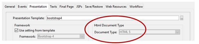
The
document type is set using Form
Properties > Presentation. If
the Framework property is set to Bootstrap,
the document type is forced to HTML5 and can’t be changed.
Form Properties:
Wherever
possible use HTML5 field display types as
these have built-in accessibility features across all browsers. In particular
use the Date field display type to
display date fields.
Similarly
check the Field Control required
option for required fields. This will result in the HTML5 required attribute being added to the field’s <input> tag,
and this also has built-in accessibility features across all browsers. This
should be used where possible in preference to validation of required fields
using scripts.
Use
a styling framework (e.g. Bootstrap) if possible
Many of the
issues described below have built-in solutions when using the Bootstrap styling
framework. As with HTML5, it’s easier to achieve compliance with the WCAG
guidelines when using Bootstrap for styling. To use Bootstrap, change the
presentation template to the supplied bootstrap4
template or use your own template and add the Bootstrap style and Javascript to this. See Using
Bootstrap or Resource Hub Bootstrap track
for more info.
Structure a Page Layout using Landmark Controls
ARIA landmarks represent the main areas of a page. Using landmarks allows a screen reader user to easily jump from one section to another and know where they are going.
A landmark can be specified using the ARIA role property, but if you use the supplied landmark controls you don’t need to do this – using the appropriate control is sufficient as all the landmark controls (or more accurately the HTML tags that they generate) map automatically to a role e.g. a Nav Control maps automatically to the navigation role, a Section Control maps automatically to a section role etc.
The landmark controls can be found in the Palette Panel of the page designer under Landmark Containers. These controls are all essentially the same as a Panel Control (which generates a <div>) and act as simple containers except that they generate a different HTML tag.
If you’re creating a new form you should always lay out the main parts of each page using these landmark controls (some suggested layouts are shown below). If you’re upgrading older forms to make them WCAG compliant, you can either insert landmark controls where appropriate or you can just add the appropriate ARIA roles to existing Panel Controls or other container controls. ARIA roles are specified in the ARIA section of a control’s properties.
Here’s a list of Landmark Controls and associated roles:
|
Role |
Mapped Control |
HTML |
Typical Use |
|
main |
main |
The main content
of the page. There should only be one main landmark per page. |
|
|
banner |
header |
Contains
the site-oriented content of each page, like the logo and/or organisation
name, usually located at the top of the page. There should only be one banner
landmark per page. |
|
|
contentInfo |
footer |
Contains content
usually found in the footer of a page, like copyright and privacy statements.
There should only be one contentinfo landmark per
page. |
|
|
navigation |
nav |
A menu or a
collection of navigation links to navigate the site or page. There might be
more than one of these on a page. |
|
|
region |
section |
Represents a main
section of a page. Each section must have an ARIA label. Good practice is not
to nest sections. |
|
|
complementary |
aside |
This
is used to designate a supporting section that relates to the main content, yet
can stand alone when separated. These sections are frequently presented as
sidebars or call-out boxes. |
|
|
article |
article |
Not
strictly a landmark role and similar to complementary, specifies independent, self-contained content. An article should
make sense on its own. |
Here are some simple rules for using landmark controls:
- Every page should have a Main Control and this should usually have an ARIA label referring to the page header text if there is one
- Static content such as logos, organisation name etc should be included in a Header Control
- Menus should be in a Nav Control, an ARIA label such as “Main Menu” is helpful
- If there is more than one section on the page, the content should be organised within Section Controls each one of which must have an ARIA label
- Static footer content should be in a Footer Control
- Normally there will be only one occurrence of each of the landmark controls on a page - with the exception of Section Controls. If there is more than one of any control type, each control should have an ARIA label.
Here are some suggested page layouts:
- Simple Page without menu, just one section:
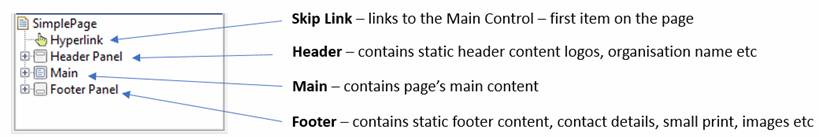
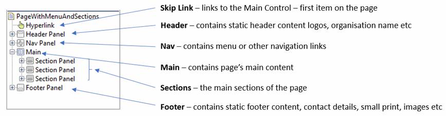
These examples show just the main landmark areas of each page, where each area can contain content of any complexity. Skip links allow users to skip to the main part of the page without wasting time reading out boring static content.
Ensure interactive content and landmarks are labelled
All interactive elements are required to have a label (known as an ARIA label or ARIA name) and this also applies to some of the landmark controls such as sections. The label is usually a short text that will be read out by a screen reader when it encounters the element. For most elements, the label is supplied automatically by the element itself e.g. the label for a button will be the text inside the button, the label for a link will be the link text etc. On the few occasions where a label is not provided automatically you should use either the ARIA Label Text or ARIA Labelled By properties: Label Text lets you enter a text, Labelled By is an alternative that allows you to use an existing text somewhere else on the page.
It’s also good practice to provide labels for landmark controls. For example, a Main Control could be labelled with an ARIA Labelled By pointing to a page header text, a Nav Panel Control could be labelled with an ARIA Label Text of “Main Menu” etc.
Note that a Section Control is required to have an ARIA label. You should not include the word “Section” in this text as the screen reader will normally read this as for example “Section Applicant Details”, and otherwise the user will hear “Section Section Applicant Details”.
Elements can also optionally have a description – usually a longer text – that is read out by a screen reader after the label. Descriptions are configured using the ARIA Described By property.
More information on how labels and descriptions are obtained by screen readers from different HTML elements can be found here.
In general, be cautious adding all ARIA attributes. The golden rule should be: No ARIA is better than bad ARIA.
Use Heading Controls
Headings – HTML tags <h1> - <h6> - provide an alternative way (to using landmarks) to communicate how page content is organised. Screen reader users can navigate a page according to its headings, listen to a list of all headings, and skip to a desired heading to begin reading at that point. The Heading Control (not to be confused with the landmark Header Control) is a generic control that can be used for any heading; the Level property is used to specifiy the heading level H1 – H6.
Headings can be used to label landmark areas via the ARIA labelledBy property. This is good practice as all users, sighted and unsighted, will then perceive the area heading to be the same.
Use of the headings <h1> - <h6> is not mandatory, but in reality either headings or appropriately labelled landmark controls are required to enable an un-sighted user to navigate around a page with ease.
Here’s some general advice on using headings:
- Avoid using heading tags just to resize text. Instead, use the CSS font-size property. Headings use size to indicate their relative importance, but CSS is preferred for general-purpose resizing.
- Nest headings using their level. The most important heading has the level 1 (<h1>), the least important heading level 6 (<h6>). Headings with an equal or higher level are interpreted as the start of a new section, headings with a lower level are interpreted as the start of new subsections that are part of the higher ranked section.
- You should only use one <h1> per page. Using more than one will not result in an error, but using only one is seen as a best practice.
- Skipping heading levels can be confusing and should be avoided where possible: Make sure that a <h2> is not followed directly by an <h4>, for example. It is ok to skip levels when closing subsections, for instance, a <h2> beginning a new section, can follow an <h4> as it closes the previous section.
Use a skip link to skip to main content
The idea of a skip link is simple: provide a link at the top of the page which jumps the user down to an anchor or target at the beginning of the main content. This enables screen reader users and also keyboard-only users to save time by navigating directly to the part of the page they are interested in. Skip links can also be created at other points on a page.
However, we generally don’t want the skip link to be visible (unless it’s the current focus element) as this has a detrimental effect on the page design. We can achieve this via CSS.
To create a skip link:
- Assign an HTML id to the link target i.e. the place you want to skip to, typically this will be a Main Control. Click on the target control and in the Properties Panel click on Html Element Properties, then enter a value e.g. main0001 in the Id field under Locators.
- If you’re using Bootstrap styling you can skip this step as Bootstrap provides the CSS we need. Otherwise create a CSS class as follows; this will make the skip link invisible unless it receives focus. This CSS can be added to any existing stylesheet used by the form; if there isn’t one you will need to create one.
.skip-link
{
position:absolute;
left:-10000px;
top:auto;
width:1px;
height:1px;
overflow:hidden;
}
.skip-link:focus
{
position:static;
width:auto;
height:auto;
}
- Add a Hyperlink Control to represent the skip link; typically this will be the first control on the page under the Page Control:
- Drag the Hyperlink Control onto the page
- Enter the text to be shown when the link has focus or is read out by a screen reader e.g. “Skip to main content”
- If using Bootstrap add classes sr-only sr-only-focusable in the class property in the Properties Panel. Otherwise add the class created above skip-link.
- Click the Link is external checkbox
- Enter # followed by the target id in the External URL field e.g. #main0001 (do not click on the … button to the right of this field)
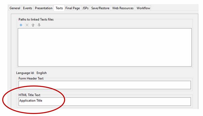
Always specify an HTML title text
The HTML title text provides a title for the application (this will be applied to all form pages). This is shown in the browser tab and is read out by screen readers. This text is required to comply with WCAG.
This text is configured using the Texts tab of Form Properties:
Ensure elements have clear focus
Keyboard users navigate between fields by pressing the tab keys, and it’s very important that the current focus is clearly visible. This applies to people who have difficulty using a mouse and might also apply to poorly sighted people using a screen reader. If you’re using a styling template such as Bootstrap the focus is generally handled for you and no further action is usually needed. But if you’re using something else, it’s possible that no focus style is configured and then the browser’s default focus will be used, and this may not be so clear.
You should, at the very least, check that the various types of elements in your application have clearly visible focus – input fields, buttons, links, interactive images etc. If you have added onclick events to non-standard HTML elements e.g. to a <div> (represented by a Panel Control) you should also check these are clearly focusable.
Focus can be styled using the :focus CSS selector. For example:
- *:focus - applies to all HTML elements
- a:focus - applies to all links
- input[type=submit]:focus, button:focus – applies to all buttons
But be cautious when introducing your own custom focus styling as it’s possible to make things worse.
Provide support for keyboard navigation
Where possible don’t add onclick functionality to HTML elements that don’t natively support this e.g. to a <div> (represented by a Panel Control). If you want to do this or if you’re upgrading existing applications that do this, you should also add onkeypress events so the functionality is also available to users navigating the page using just the keyboard.
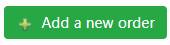
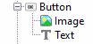
As an alternative, consider adding Text Controls and Image Controls to a Button Control to create the same effect. This will generate native elements (i.e. a <button> tag) that will have accessibility built in by the browser. These will be focusable using the Tab key; they will respond to keyboard events (like the Enter, Space, and arrow keys); and they will have semantic roles, states, and properties used by accessibility tools. Their default styling should also meet the accessibility requirements.
Use alternate texts for images
Any images that can be clicked and any other images that have significance should have an alternate text – this will be read out to a screen reader user. For Image Controls this is configured using the Alternative text property.
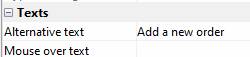
Images that are purely cosmetic e.g. organisation logo at the top of the page, do not require an alternate text. But any image that is significant within the context of a page should have an alternate text. For example, if a page is displaying a list of people with accompanying photographs, then each photograph requires an appropriate alternate text e.g. “Photo of xxxxxxx”.
Don’t use an image when text can easily convey the same meaning
For example. don’t be tempted to use an image containing text for a Register or Sign-up here button just because it looks a bit better. Instead use a Button Control with plain text and style it appropriately.
Use labels with input fields
In general you just need to ensure that all fields and table columns presented to the user have label texts configured in the field’s properties. The Verj.io system will ensure that this label is correctly associated with the field, even when the label is not displayed. It does this using the label for syntax e.g.
<label
for="firstname">First
name:</label>
<input
type="text" name="firstname"
id="firstname">
Screen readers will read out the label when a user encounters an input field.
If you want to override this mechanism you can use either the ARIA Label Text or ARIA Labelled By control properties e.g. if you wanted to show different labels to sighted and un-sighted users. Note that these ARIA attributes are control properties – whereas the label text shown above is a field property.
In general be cautious when adding ARIA attributes. The golden rule should be: No ARIA is better than bad ARIA.
Provide descriptions for input fields where appropriate
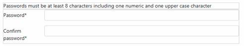
Fields and table columns can also optionally have an ARIA description – usually a longer text read out by a screen reader after the label. If an information text (i.e. field help text) is configured for a field, this will be added automatically as the ARIA description and you don’t need to take any further action.
This mechanism can be overridden using the ARIA Described By control property. For example, you might want to add a password information text from an existing Text Control as an ARIA description for password fields:
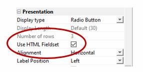
Use HTML fieldsets for lists displayed as radio buttons or checkboxes
When a list is displayed with radio buttons or checkboxes it should be displayed using an HTML <fieldset> tag and the field label text should be included in a <legend> tag. To achieve this, check the Use HTML Fieldset option in the Presentation group under Field Properties (note that this is a property of the field as opposed to the control).
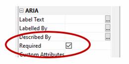
Use ARIA required for input fields when the required attribute is not checked
If a required field is not explicitly marked as required (in the Field Control properties) and is marked as required in some other way e.g. by adding an * to the label text, then the required option under the control’s ARIA properties should be checked. This results in the aria-required attribute being added to the <input> tag which allows a screen reader to inform an un-sighted user that the field is required.
Don’t use placeholder texts instead of input field labels
At the time of writing this documentation, the use of placeholders instead of labels is discouraged for accessibility reasons, though this advice may well change over time. Here are some quotes and references:
“Placeholder text provides
instructions or an example of the required data format inside form fields that
have not yet been edited by the user. Placeholder text is usually displayed
with lower color contrast than text provided by users, and it disappears from
form fields when users start entering text. If the placeholder text contains
instructional information or examples that disappear, it makes it more
difficult for users to check their responses before submitting the form.
While placeholder text provides
valuable guidance for many users, placeholder text is not a replacement for labels.
Assistive technologies, such as screen readers, do not treat placeholder text
as labels. Moreover, at the time of writing this tutorial, placeholder text is
not broadly supported across assistive technologies and not displayed in older
web browsers.”
Here are more links to accessibility articles discussing placeholders: WAI Tutorials, https://www.w3.org/WAI/GL/low-vision-a11y-tf/wiki/Placeholder_Research
Use table captions to provide a table description
A table caption should be used to enable a screen reader to read out a descriptive text for a table. This is configured using the Texts tab of Table Control Properties. A caption text can be used to provide a description for a table for both sighted and un-sighted users.
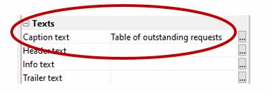
A caption text should be preferred over a table header text or any other table descriptive text.
Don’t use color alone to convey meaning
Use of color is an essential part of web design, but it should not be the only means of communicating information as this discriminates against people with color blindness and screen reader users. For example, a background color might be used in a table cell to indicate status, the same information could also be communicated as a text in the table cell.
Use appropriate text color contrast
There are two WCAG guidelines providing details of the degree of contrast between colors when displaying texts. These guidelines apply whenever there is a color contrast e.g. between foreground and background colors, which includes when text is displayed on a white background, so these guidelines effectively apply to all texts, and they apply particularly to links.
- Guideline 1.4.3 says the contrast ratio should be at least 4.5:1 (level AA)
- Guideline 1.4.6 says the contrast ratio should be at least 7:1 (level AAA)
These two directives are essentially the same except for the contrast level. If you are comfortable with just meeting the lower standard – AA – then a contrast ratio of 4.5:1 is sufficient.
The easiest way to work out whether your color scheme is achieving this is to use one of the many accessibility tools e.g. with Chrome Dev Tools, highlight a text or link you want to check, then navigate to the color CSS property under Styles and click on the rectangular color swatch next to the color code – this is shown as color picker. The contrast ratio is shown about 2/3 of the way down this color picker panel.
Here’s an example of a link that fails the guideline: contrast ratio of 2.05 is less then the minimum 4.5.
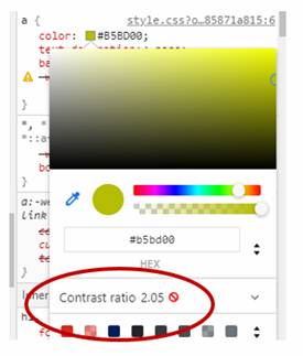
You can also use this panel to click on some alternative colors and watch the contrast ratio change.
Ensure the page is readable and functional when the page is zoomed to 400%
The intention of this guideline is to support people with low vision who need to enlarge text. This needs to be done without loss of information or functionality and without the need to scroll either vertically or horizontally.
Using a responsive web design approach is the most effective method of achieving the goal of allowing people to zoom in to 400%. It is enabled by CSS media queries which reformat the web content for different viewport widths (at particular break points) in order to provide optimised layouts. Importantly, these breakpoints are not only triggered by narrower viewports, but also when users employ the browser zoom function to zoom into the page.
Note that most mobile browsers work differently: they normally support reflow only when changing the orientation of the device - content will be adjusted to the new viewport width, and they don’t reflow when the user zooms. This means that zoomed content in most mobile browsers involves two-dimensional scrolling regardless of how the page is designed. This lack of magnified reflow support in browsers on mobile operating systems is regarded as a browser support issue rather than as a WCAG failure.
There are some specific exceptions to this guideline including data in tables and graphical data representations e.g. charts.
The Bootstrap styling framework implements responsive web design so using a Bootstrap presentation template is the easiest way to achieve this objective. See Using Bootstrap or Resource Hub Bootstrap track for more info.
Use ARIA attributes where appropriate
The use of various ARIA attributes has already been discussed in many of the points above including: role, aria-label, aria-labelledBy, aria-describedBy, aria-required. The Properties Panel for most controls includes an ARIA section where these properties can be configured.
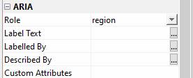
There are many more ARIA properties and states than those shown above, and additional properties can be added using Custom Attributes at the bottom of this ARIA section. Properties should be entered in the format name=value or just name if there is no applicable value; multiple properties should be comma separated.
In general be cautious when adding ARIA attributes. The golden rule should be: No ARIA is better than bad ARIA.
Use of error, warning and info messages
Messages added using any of the Javascript API methods addxxxxMessage() or via the FPL message command are presented in a <div> with an appropriate role so that screen reader users can be notified:
|
Message level |
Role |
|
Error |
alert |
|
Warning |
status |
|
Info |
status |
This is built into the Verj.io system and does not require any action on your part – other than to use this messaging API when you want to present a message to the user.
Keep content clear and concise
Use simple language and formatting, as appropriate for the context. This guideline is to help people with a cognitive impairment – this includes people with a reading/understanding difficulties.
- Write in short, clear sentences and paragraphs
- Don’t make users read long blocks of content
- Avoid using unnecessarily complex words and phrases
- Use list formatting as appropriate
- Follow best practice recommendations for line lengths, font size, line height, word spacing etc.
Use consistent design
For multi-page applications:
- Use consistent layouts
- Use the same page headers e.g. for logo, organisation name, search boxes, common menus etc