Bootstrap Field Layout
See also: Bootstrap 4 documentation, Using Bootstrap with Verj.io, Bootstrap Grid Controls
Description
This is a responsive layout that presents fields in a bootstrap grid structure where field labels and field editors are aligned; the relative widths of the label and editor columns can be configured for different device viewport sizes. This layout is only available when a form is configured to use bootstrap i.e. the framework property in Form Properties is configured to use bootstrap (by default this property is inherited from the Presentation Template).
Each field is placed in a grid row with bootstrap class form-group-row, then the label and editor portions are placed in columns with the appropriate col-xxx classes added based on the layout’s configured properties. Controls other than fields can also be added and they are presented in full width columns.
Field info (help) texts can be displayed either underneath the editor, or for longer texts, in a popup where the popup icon is also shown underneath the editor. The option to display field help text to the right of the editor is not supported for this layout.
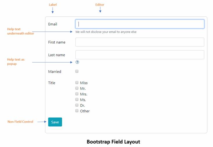
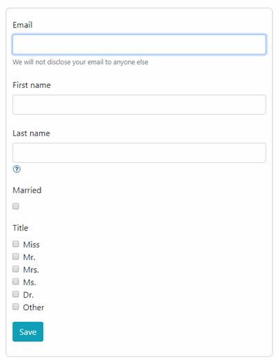
By default this will break to a vertical layout for extra small devices (phones):
Layout Properties
See also control common properties and local/inherited control properties.
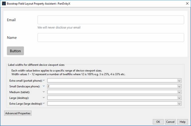
Width Properties
These width properties let you adjust the relative width of the label and editor columns for different device viewport sizes. These configured values are then use to construct col-xxx bootstrap class names which are added to the field label and editor. For a more complete discussion on how this works see the Bootstrap Grid Controls.
Note that leaving the Extra small property as unconfigured causes the layout to break to a vertical layout for extra small devices (phones) as shown above.
|
Property |
Description |
Name1 |
Type1 |
Get1 |
Set1 |
Get/Set Values1 |
|
Extra small |
See above |
extraSmallWidth |
Character |
Yes |
Yes |
See above |
|
Small |
See above |
smallWidth |
Character |
Yes |
Yes |
See above |
|
Medium |
See above |
mediumWidth |
Character |
Yes |
Yes |
See above |
|
Large |
See above |
largeWidth |
Character |
Yes |
Yes |
See above |
|
Extra large |
See above |
extraLargeWidth |
Character |
Yes |
Yes |
See above |
Advanced Properties
|
Property |
Description |
Name1 |
Type1 |
Get1 |
Set1 |
Get/Set Values1 |
|
Row class |
Additional classes to added to each row |
rowClass |
Character |
Yes |
Yes |
As per HTML class parameter |
|
Field label class |
Additional classes to added to each field label |
fieldLabelClass |
Character |
Yes |
Yes |
As per HTML class
parameter |
|
Field editor class |
Additional classes to added to each field editor |
fieldEditorClass |
Character |
Yes |
Yes |
As per HTML class
parameter |
|
Field info class |
Additional classes to added to each field help text |
fieldInfoClass |
Character |
Yes |
Yes |
As per HTML class
parameter |
1 See accessing control properties from scripts